Inbound Voice Reports
Campaigns, abandons, service level and typification of what comes in
History or analytics: which report to open
The Inbound Voice group is the most crowded in all of Audara's analytics, and before going report by report it helps to know they come in two families. Picking the wrong family is the most common way to spend half an hour looking for a figure where it is not.
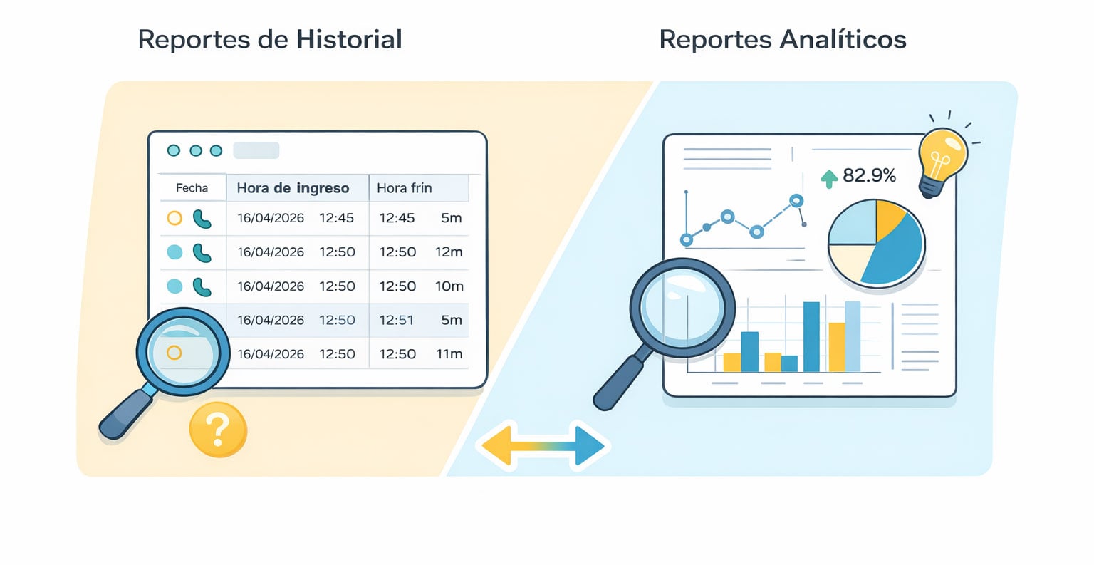
- History reports
- One row per call. They carry date, time, duration, number, agent and typification, and usually have no graph because their job is to let you go through records one at a time. They are Calls History, Abandons History and Call Tracking.
- Analytical reports
- Aggregated metrics for a period. They boil thousands of calls down to indicators and nearly always carry a graph view. They are Campaign Activity, Service Level, Abandon durations, Campaign Effectiveness, Occupancy and Campaign Typification.
In practice they get used in sequence, and that is the method: the analytical one tells you where the problem is, the history one lets you see what happened. If occupancy shows a spike of abandons between eleven and twelve, the abandons history hands you the actual calls from that hour.
The product says campaign for what is technically an inbound call queue. You will see "campaign" throughout the analytics; elsewhere in the system that same thing shows up as a queue, and they are one and the same.
How the toolbar, the filters and the CSV download work is in the Reports article, because it is the same across the system. What follows is what belongs to each report.
Four of these reports currently exist in two versions. In the list you will find Campaign Activity and a second Campaign Activity under the very same name, and likewise two entries each for Calls History, Abandons History and Activity by Route. This article describes the newer versions, which are the ones being maintained. Which of the two you get depends on your licence.
Campaign Activity
This is the group's central report, and the one most often opened. It shows how each inbound campaign behaved over time: how many calls came in, how many were answered, how many were lost and how fast they were picked up.
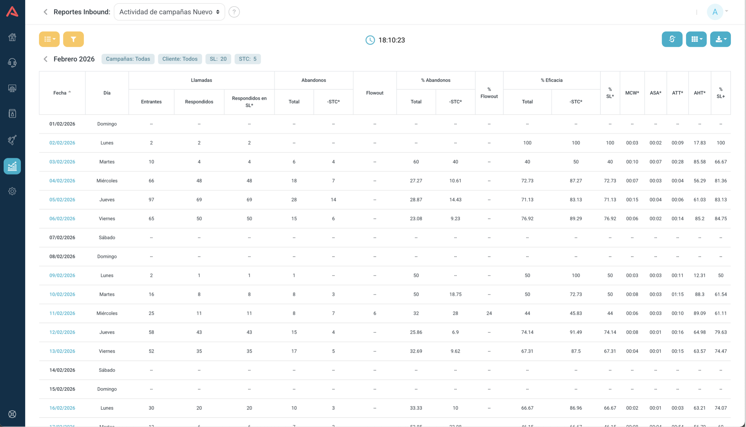
The three levels
The report is built for drilling down, and you navigate it by clicking the row you care about:
- Months
- The view it opens on. One row per month.
- Days
- Click a month and you get its days.
- Hours
- Click a day and you get its hours.
To climb back up a level there is an arrow beside the title, in the header.
What exists only in the hourly view
Inside a specific day two controls appear that are not there at the other levels.
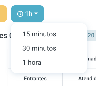
The first splits the day into bands of 1 hour, 30 minutes or 15 minutes. It is what makes a spike visible that the hourly view averages away: half an hour of saturation inside a quiet hour disappears if you only look at hours.
The second turns on the connected agents metric, which tells you how many people were on average available in each band. It is what turns an abandon figure into an explanation.
The three views
The yellow view button offers three options here rather than two:
- List
- The metrics grid, and the default.
- Graph
- A timeline with three series: incoming, answered and abandoned.
- Campaign Graph
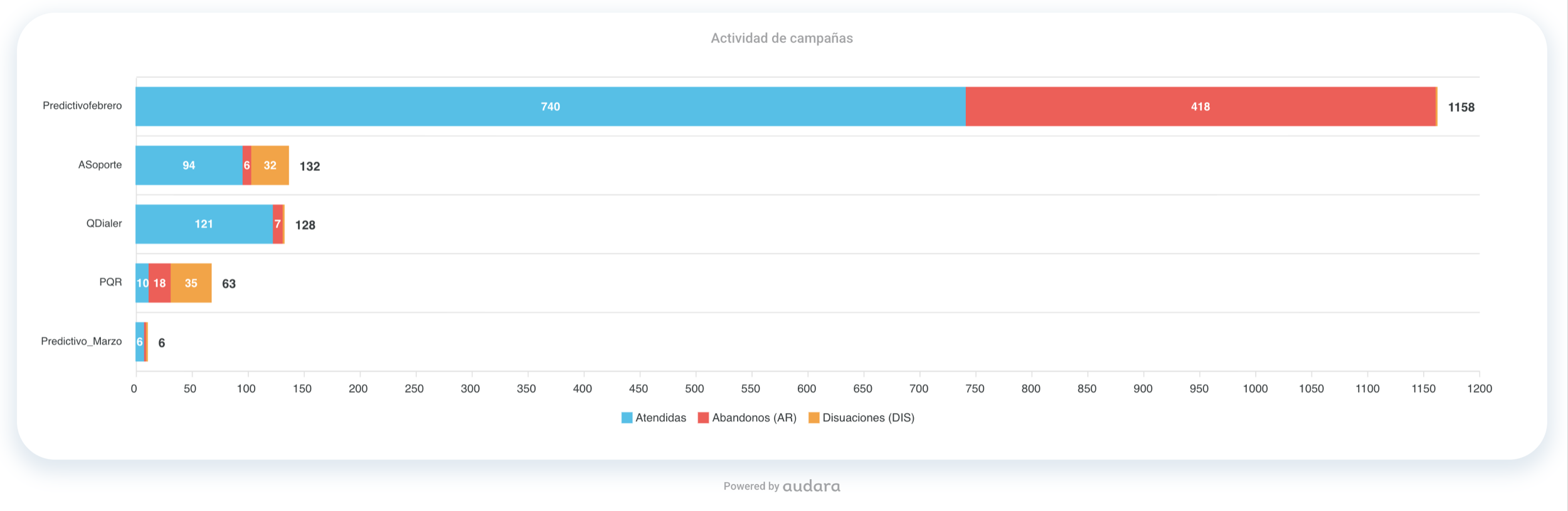
- Bars comparing campaigns against each other. It has its own selector to reorder them, by most abandons for instance.
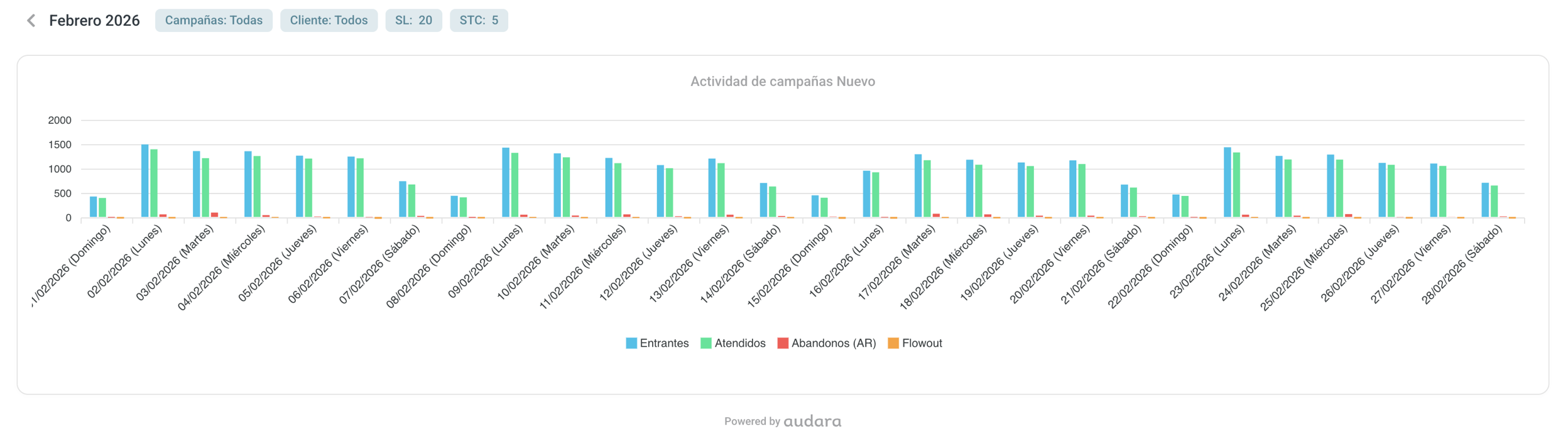
The toolbar buttons
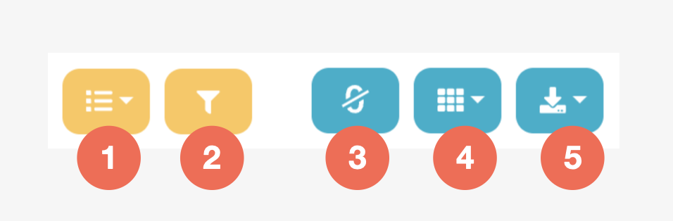
On the left, in yellow, the view selector and the filter. On the right, in blue, three controls that belong to the list: hide zeros, which clears out the bands with no activity; the column selector, to keep only the metrics you need; and the download.
The filters
- Date
- Today, Yesterday, Last 7 days, Year or a range. The range is capped at 31 days: once you pick the start date, the end date calendar will not go past that.
- Group, Campaigns and Client
- To narrow down to part of the operation.
- SL (Sec.)
- The seconds within which a call counts as answered on time. You change it right here and the report recalculates.
- STC (Sec.)
- The seconds below which an abandon counts as a short call and is not penalised.
That SL and STC are filters rather than fixed settings is the most powerful thing about this report: it lets you ask "what if our target were 30 seconds instead of 20?" and see the answer immediately, without changing anything for anyone. It does mean two people can look at the same day and see different numbers, so when you share a figure it is worth saying which SL it came from.
Metric dictionary
The columns follow standard contact centre vocabulary. To read the formulas:
| Symbol | What it is |
|---|---|
| E | Incoming |
| R | Answered |
| R_SL | Answered within SL |
| AB | Total abandons |
| AB_-STC | Abandons excluding short calls |
| STC | The short calls: AB minus AB_-STC |
| FO | Flowout, the disconnections |
And these are the columns:
| Column | What it tells you |
|---|---|
| Date | The row's period |
| Day | The day of the week |
| Incoming | Every call that reached the campaign |
| Answered | The ones an agent picked up |
| Abandons | The ones the customer dropped before being answered |
| Flowout | The ones that left the campaign by overflow, transfer to IVR, maximum wait or voicemail |
| Answered SL | The ones answered before the SL ran out |
| Abandons -STC | Net abandons, without the ones who hung up in the first seconds |
| % Abandon | What share of what came in was lost: (AB / E) × 100 |
| % Abandon -STC | The same without the short calls: (AB_-STC / E) × 100 |
| % FlowOut | What share left the campaign without abandoning: (FO / E) × 100 |
| % Effectiveness | What share was answered: (R / E) × 100 |
| % Effectiveness -STC | The same with short calls taken out of the total: (R / (E - STC)) × 100 |
| % SL | What share was answered on time: (R_SL / E) × 100 |
| % SL+ | SL over valid interactions: R_SL / (R + FO + AB - STC) × 100 |
| MCW | Maximum Call Wait: the longest anyone waited before being answered |
| ASA | Average Speed of Answer: what people waited on average |
| ATT | Average Talk Time: how long the conversation lasted on average |
| AHT | Average Handle Time: the agent's average occupancy, which is talk plus hold plus ACW |
Notice that % Abandon and % Effectiveness do not add up to 100, and that is not a bug: flowout is missing, calls that were neither answered nor abandoned but went somewhere else. A high flowout is a campaign sending its traffic elsewhere, and that may be by design or may be a misconfigured rule.
What you decide with it
This is the sizing report. With volume by time band and service level side by side you can see where you are short of people and where you are over, and the connected agents metric confirms whether the hunch was right.
A high ASA is almost always a shortage of available agents. A high AHT is something else: complex calls, slow processes, or people who need training. And a high flowout is not a people problem at all but a campaign configuration one.
Calls History
The log of inbound calls that did get answered. One row per interaction, with everything that was recorded about it.
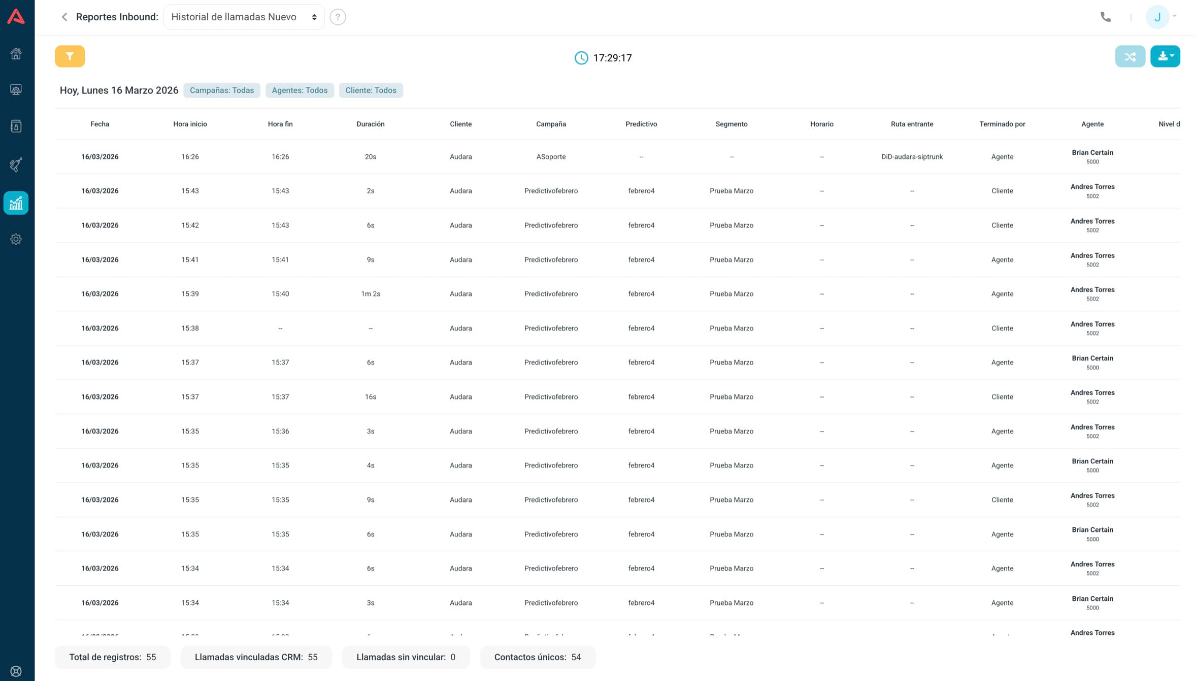
It has no graph view, and that is deliberate: it is built to find one call, not to show trends.
Field dictionary
| Column | What it tells you |
|---|---|
| Date | The day of the call |
| Start time | When it began |
| End time | When it ended |
| Duration | How long it lasted in total |
| Client | The client or account it belongs to |
| Campaign | Which inbound campaign it reached |
| Predictive | The predictive dialer that handed the call over, if it came from one |
| Segment | The contact segment |
| CRM | Which CRM is attached |
| Schedule | The schedule setting that applied |
| Inbound route | Which route the call came in on |
| Finished by | Who hung up: the agent or the caller |
| Agent | Who handled it |
| Agent number | Their number |
| Agent level | Their level within the campaign |
| Extension | The SIP extension they answered on |
| Contact | The CRM contact |
| Contact key | Their unique identifier |
| Contact phone | The customer's number |
| ID | The call's unique identifier |
| Queue ID | The campaign's technical identifier |
| Occupancy | Everything the agent spent on this call |
| Queued time | What the customer waited before being answered |
| Hold time | How long they were on hold during the conversation |
| ACW config | The wrap-up time the campaign has set |
| ACW time | What the agent actually used |
| ACW alarm | Whether they went over the configured time |
| Conversion | Whether the call ended in a positive result |
| Typification 1, 2 and 3 | How the agent classified it |
| Open Typification | Their free-text comment |
| CSAT | The satisfaction score, if there was a survey |
| FCR | Whether it was resolved on first contact |
| NPS | The Net Promoter Score, if there was a survey |
| Custom rating | The result of your own survey, if the campaign has one |
Values in blue are links. The ID opens the full interaction detail, with the recording and the transcript; the contact's name opens their CRM record with all its fields.
The filters
It has the most filters in the group, because it is built to find one call among thousands: Date, Group, Campaigns, Agents, Client, Typification, Survey and Survey value, Schedule, Contact phone, Contact key, Contact name and ACW alarm.
Combining with CRM data
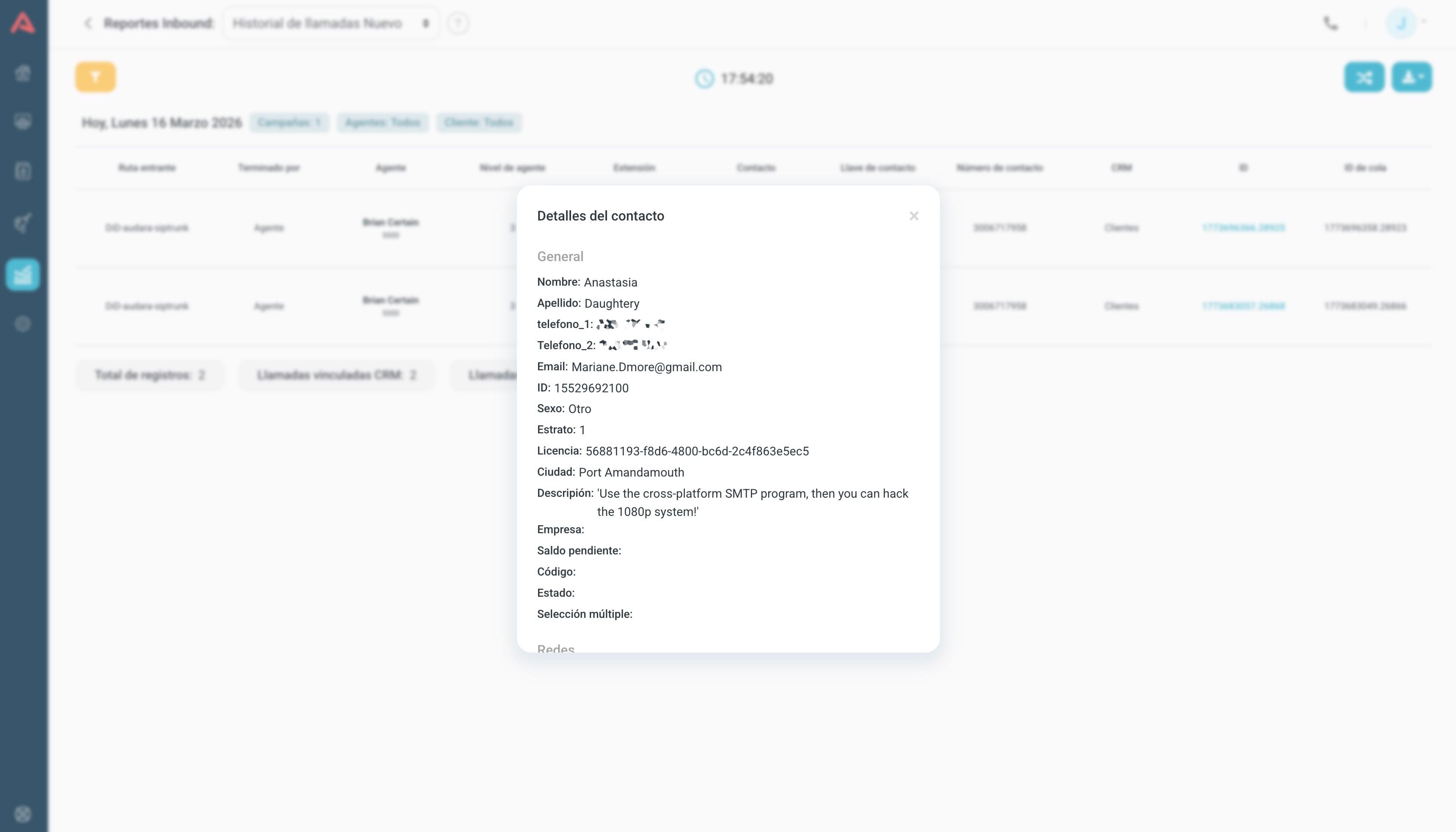
Top right there is a combine option, which merges the contact's CRM fields with the call history data so you can download them as one file.

To combine you have to have filtered down to a single campaign. It will not work across several, because each campaign can have its own CRM with different fields, and there would be no coherent table to build.
The totals at the bottom

- Total records
- How many calls the report holds with the filters you set.
- CRM-linked calls
- The ones tied to a contact, which is why they also show up in that contact's CRM history.
- Unlinked calls
- The ones tied to no contact at all.
- Unique contacts
- How many distinct people are behind those calls.
The gap between total records and unique contacts is the one that matters: if one number shows up in two calls, the total says 2 and unique contacts says 1. When that gap widens, people are calling more than once, and that is rarely a good sign.
What you decide with it
This is the report for audits and complaints. When someone says they were handled badly, here is the call, who took it, how long they held them and how they classified it, and the ID gets you to the recording.
It also does aggregate work through the back door: filtering by ACW alarm pulls out every call where somebody ran over their wrap-up time.
Abandons History
The twin of the previous one, for the calls you lost. One row per abandoned call, with how long the customer managed to wait before hanging up.
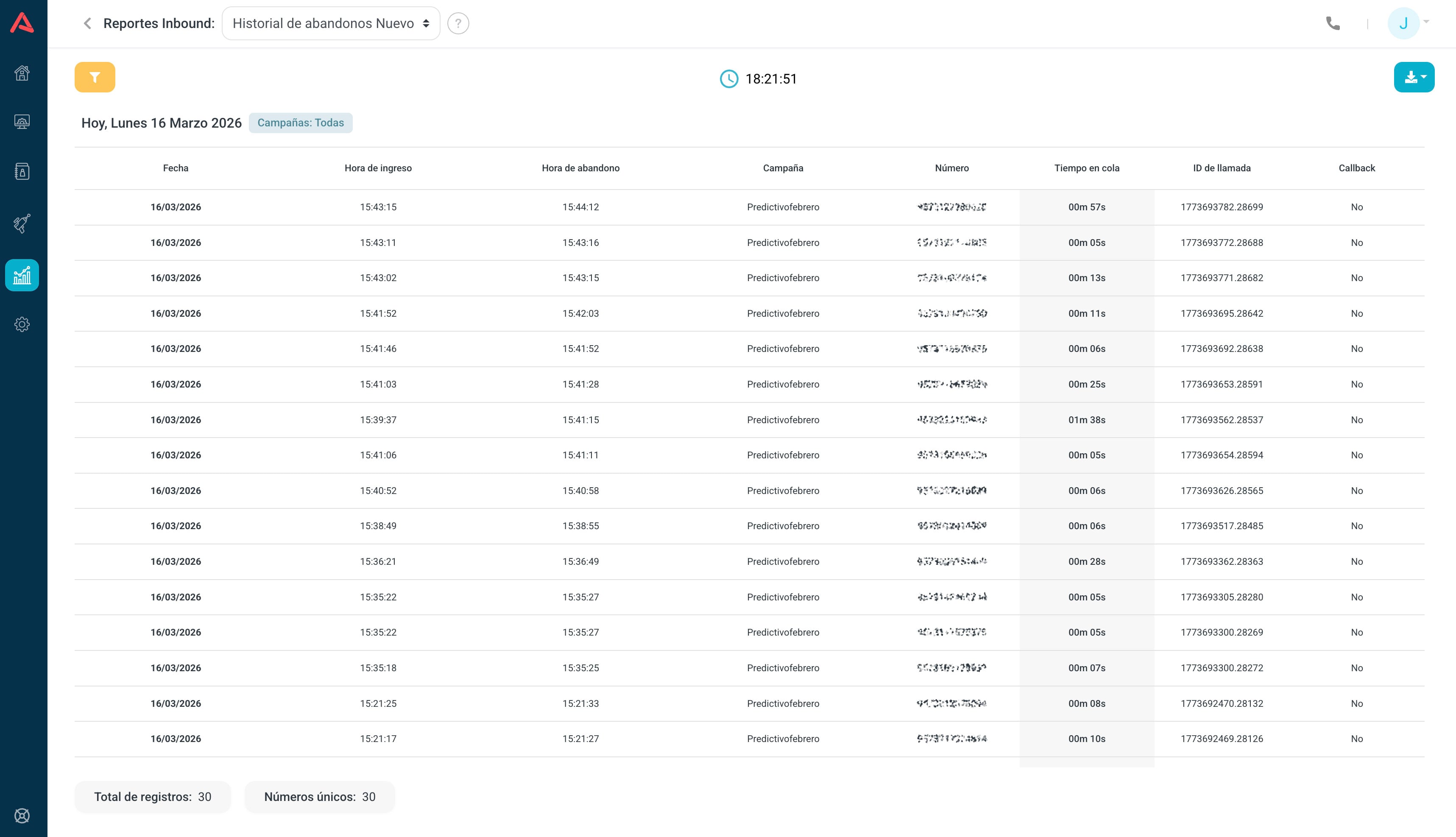
| Column | What it tells you |
|---|---|
| Queue | Where they were waiting |
| Date | The day |
| Start time | When they entered the queue |
| End time | When they hung up |
| Number | The phone they called from |
| Queue time | How long they waited before giving up |
| Call ID | The unique identifier |
| Callback | Whether a call-back was recorded |
It filters by Date, Group, Campaigns and Callback, and below it carries the total records and the unique numbers.
Comparing total records against unique numbers is the first thing to read. A hundred abandons from a hundred different numbers is a capacity problem. A hundred abandons from thirty numbers is worse: that is thirty people who tried three times each and still have not been helped, and those are the ones who call to complain.
The Callback column changes how an abandon reads. If the system offered a call-back and the person took it, you did not lose them: it got scheduled. That follow-up shows up in the Callback report.
Abandon durations
This one no longer lists calls: it sorts abandons by how long each customer waited before hanging up. It answers not how many left but when they left.
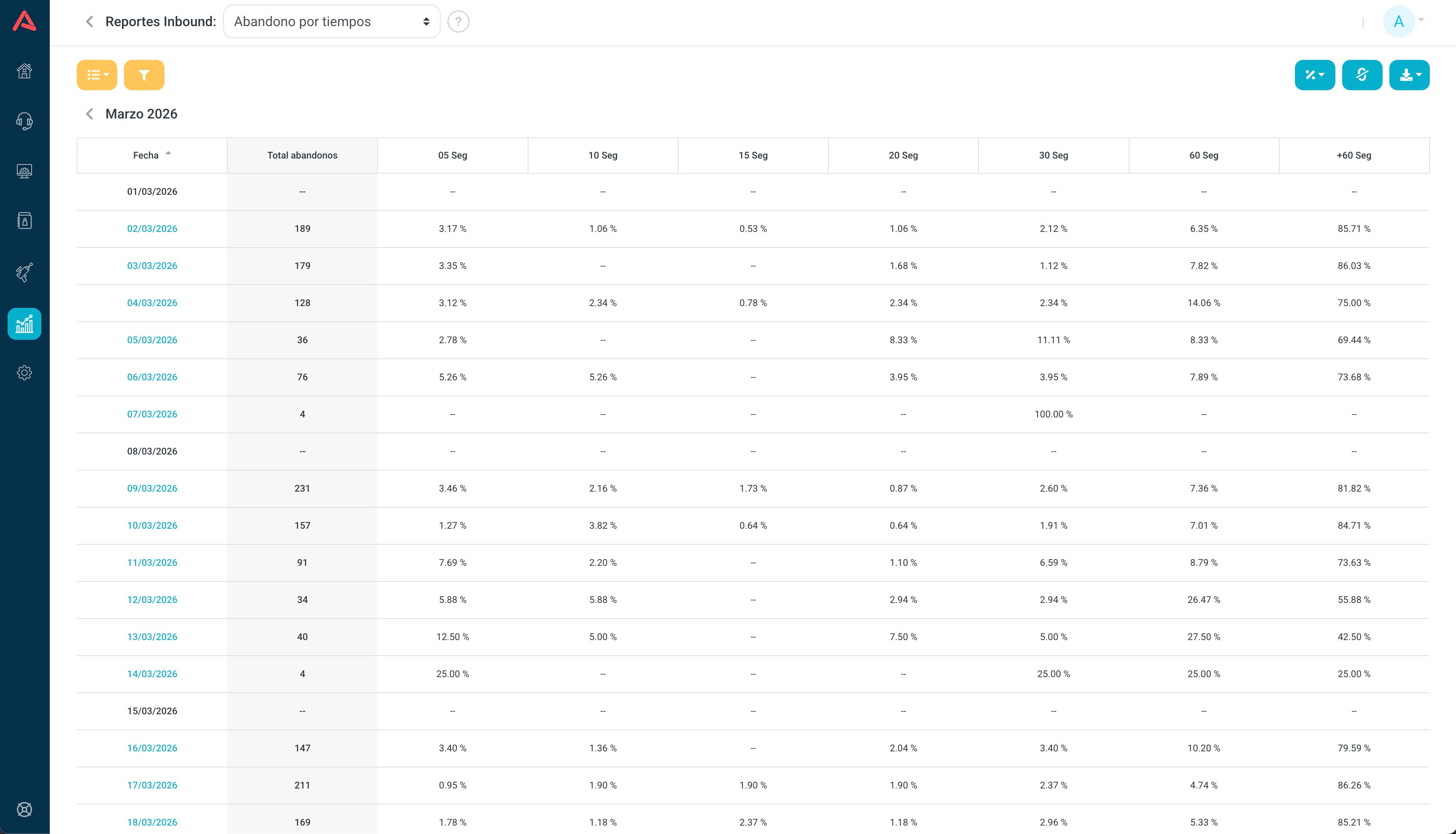
The bands are 5, 10, 15, 20, 30 and 60 seconds, plus a +60 for those who waited longer. And like the activity report, it drills down: month to day, day to hour.
Counts or percentages
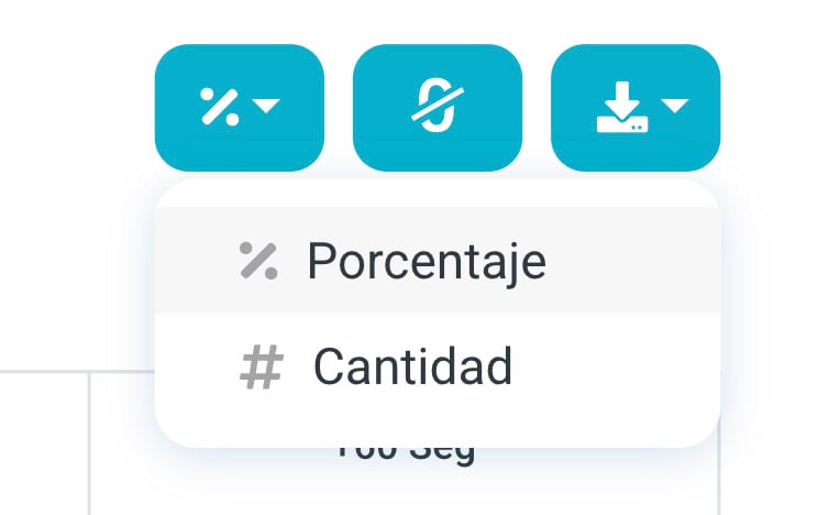
Top right there is a button that switches between counts and percentages. Both are worth a look: the percentage says where the concentration is, the count says whether the problem is big.
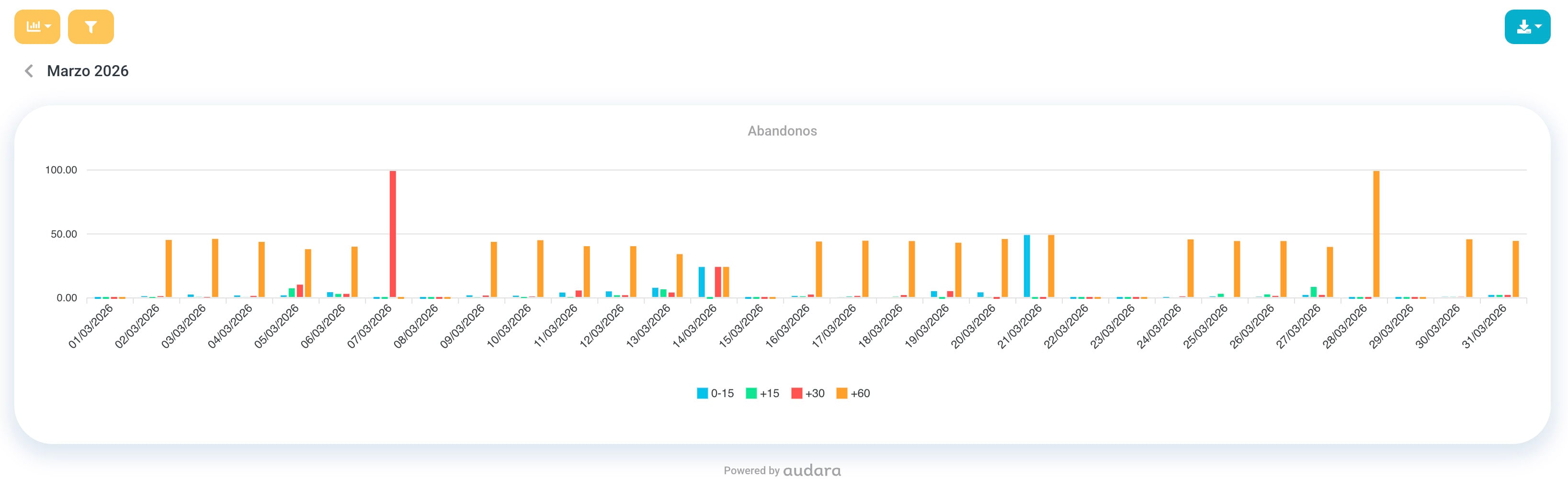
Graph view
The same distribution drawn out, which is where you see the shape of the curve at a glance.
The columns
| Column | What it tells you |
|---|---|
| Date / Hour | The row's period, depending on the level you are at |
| Total abandons | How many calls were lost in that period |
| 05 Sec | The ones who hung up in the first 5 seconds |
| 10 Sec | Between 5 and 10 seconds |
| 15 Sec | Between 10 and 15 |
| 20 Sec | Between 15 and 20 |
| 30 Sec | Between 20 and 30 |
| 60 Sec | Between 30 and 60 |
| +60 Sec | After the minute mark |
Below you set an abandon threshold that paints the values green or red, so the table audits at a glance. It filters by Date, Groups and Campaigns.
What you decide with it
The shape of the curve says different things depending on where the hump sits, and this is the reading that makes the report worth opening:
- Piled up in the first seconds
- Rarely a shortage of agents. Usually people who misdialled, or an IVR that confuses them into hanging up. These are the ones the STC filter discounts in the other reports.
- Piled up in the middle, between 10 and 30 seconds
- That is where your customers' patience runs out, and it is the sign that you are brushing up against what they are willing to wait.
- Piled up past 60 seconds
- Saturation: people genuinely waited and you still did not get to them. Either you are short of agents or the queue is badly balanced.
Service Level
The mirror of the previous one. Where that one sorts the people who left, this one sorts the ones you did answer, by how long you took.
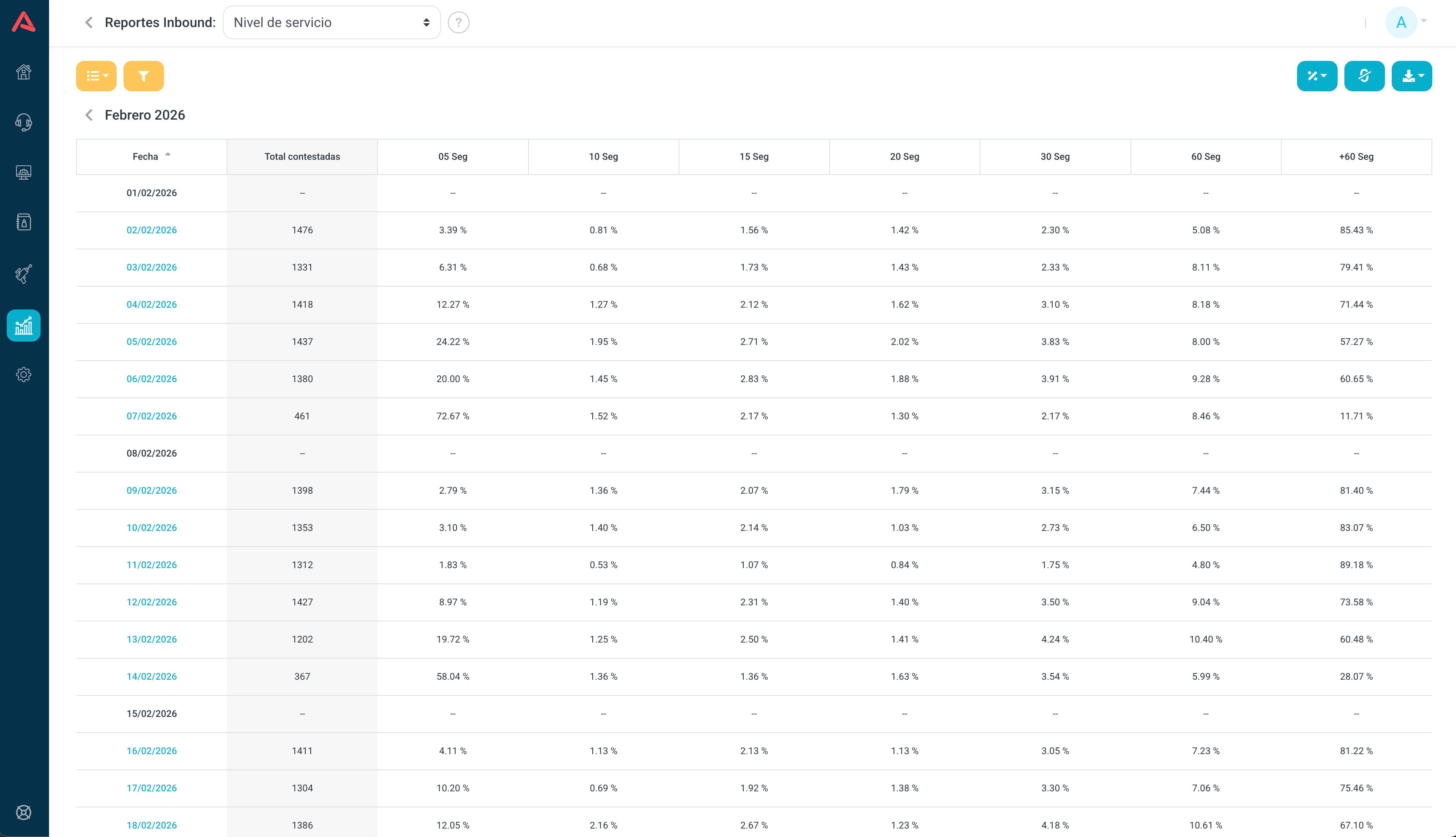
It uses the same bands from 5 to 60 seconds plus the +60, the same counts-or-percentages button, and the same graph view. It drills down by month, day and hour, and inside a day it goes all the way to 30 and 15 minute intervals.
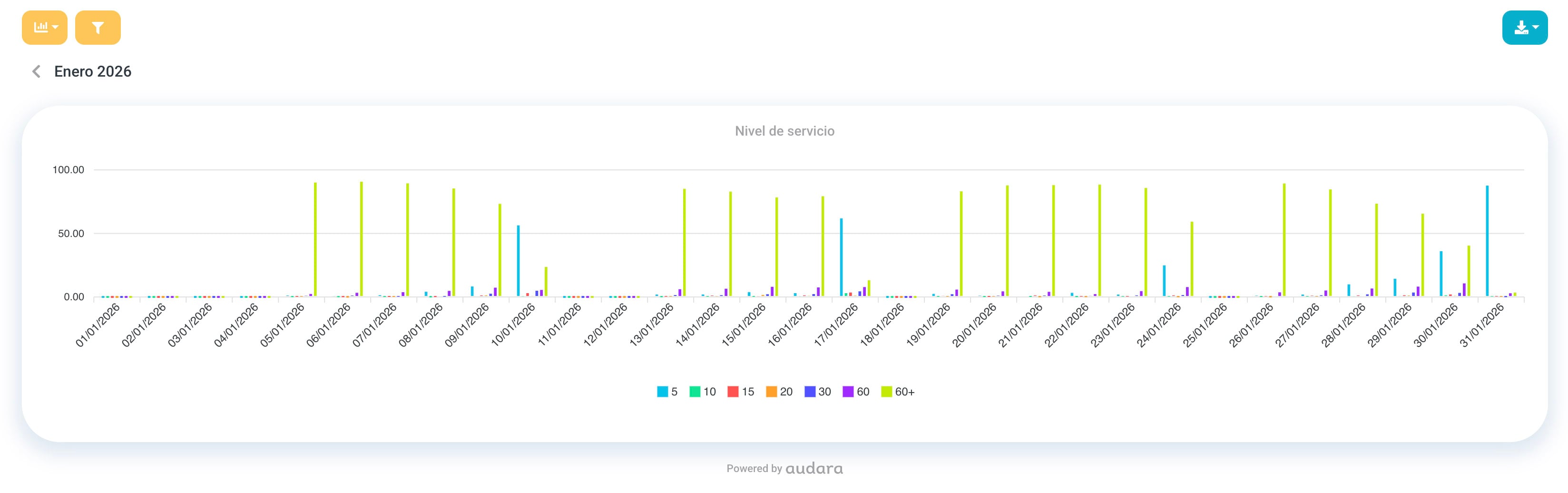
| Column | What it tells you |
|---|---|
| Date / Hour | The row's period |
| Total answered | How many were handled in that period |
| 05 Sec | The ones answered in the first 5 seconds |
| 10 Sec | Between 5 and 10 seconds |
| 15 Sec | Between 10 and 15 |
| 20 Sec | Between 15 and 20 |
| 30 Sec | Between 20 and 30 |
| 60 Sec | Between 30 and 60 |
| +60 Sec | After the minute mark |
It carries its own threshold to paint compliance, and filters by Date, Groups and Campaigns.
This report and the abandon durations one are meant to be read together, in that order. One answers how fast you pick up, the other when people give up on you. If your response curve piles up at 20 seconds and your abandon curve starts climbing at 15, the problem is not that you answer slowly but that you answer just after your customers run out of patience.
Call Tracking
The most technical report in the group and the one that settles arguments. It shows a call's full journey, event by event, from the moment it arrives to the moment it ends.
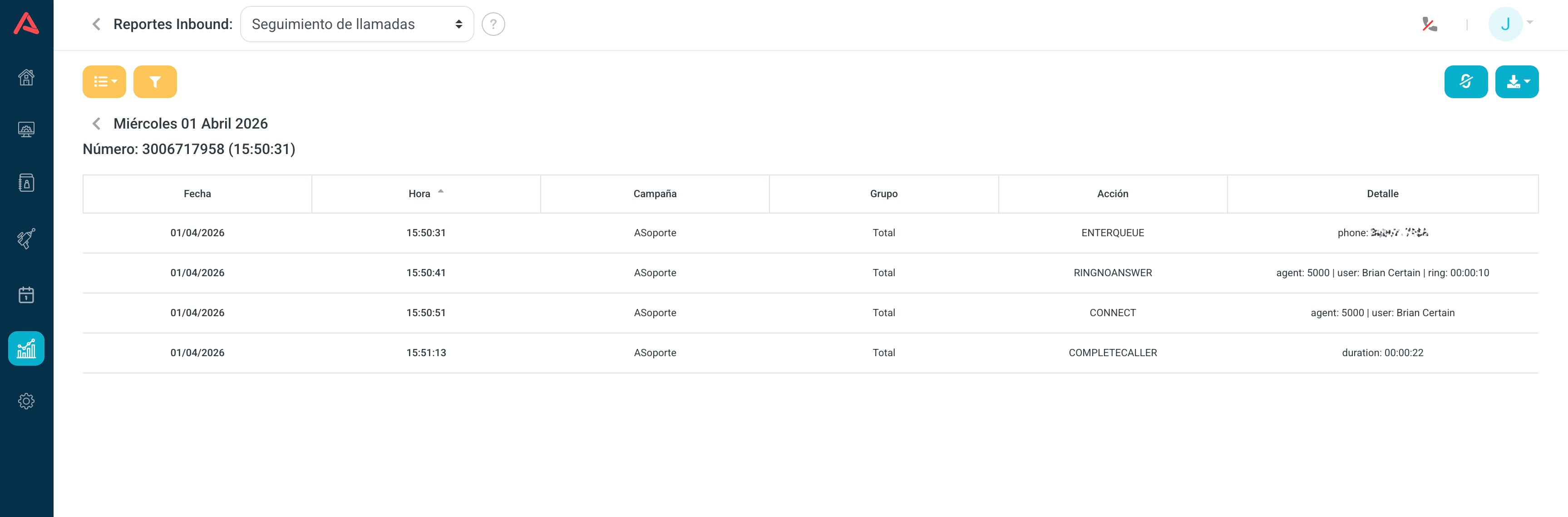
The two levels
Up top, a summary by period with two columns: Calls, how many there were, and Callers, how many distinct numbers made them.
Go into a day and then into a number, and the trace appears: each event with its Date, its exact Time, the Campaign, the Group, the Action and the Detail.
The actions
The event names come from the phone switch and are not translated, so it helps to know what they mean:
| Action | What happened |
|---|---|
ENTERQUEUE | The call entered the campaign |
RINGNOANSWER | An agent was rung and did not pick up |
CONNECT | An agent answered |
COMPLETECALLER | It ended, and the customer hung up |
COMPLETEAGENT | It ended, and the agent hung up |
ABANDON | The customer hung up before being answered |
A normal call is ENTERQUEUE and CONNECT and that is it. A call with problems is ENTERQUEUE, three RINGNOANSWER in a row and an ABANDON, and there you see exactly who was rung and who did not pick up.
It filters by Date, Groups, Campaigns and Number, which is the one you actually use when you are chasing a case.
This is the report for when a customer says "nobody answered me". Here you see whether the call came in, who it was assigned to, how many attempts were made and what really happened. It is not an everyday report: it is the one you open when something has to be proven.
Call Termination
It counts who hung up: the agent or the customer. It sounds minor and it is not.
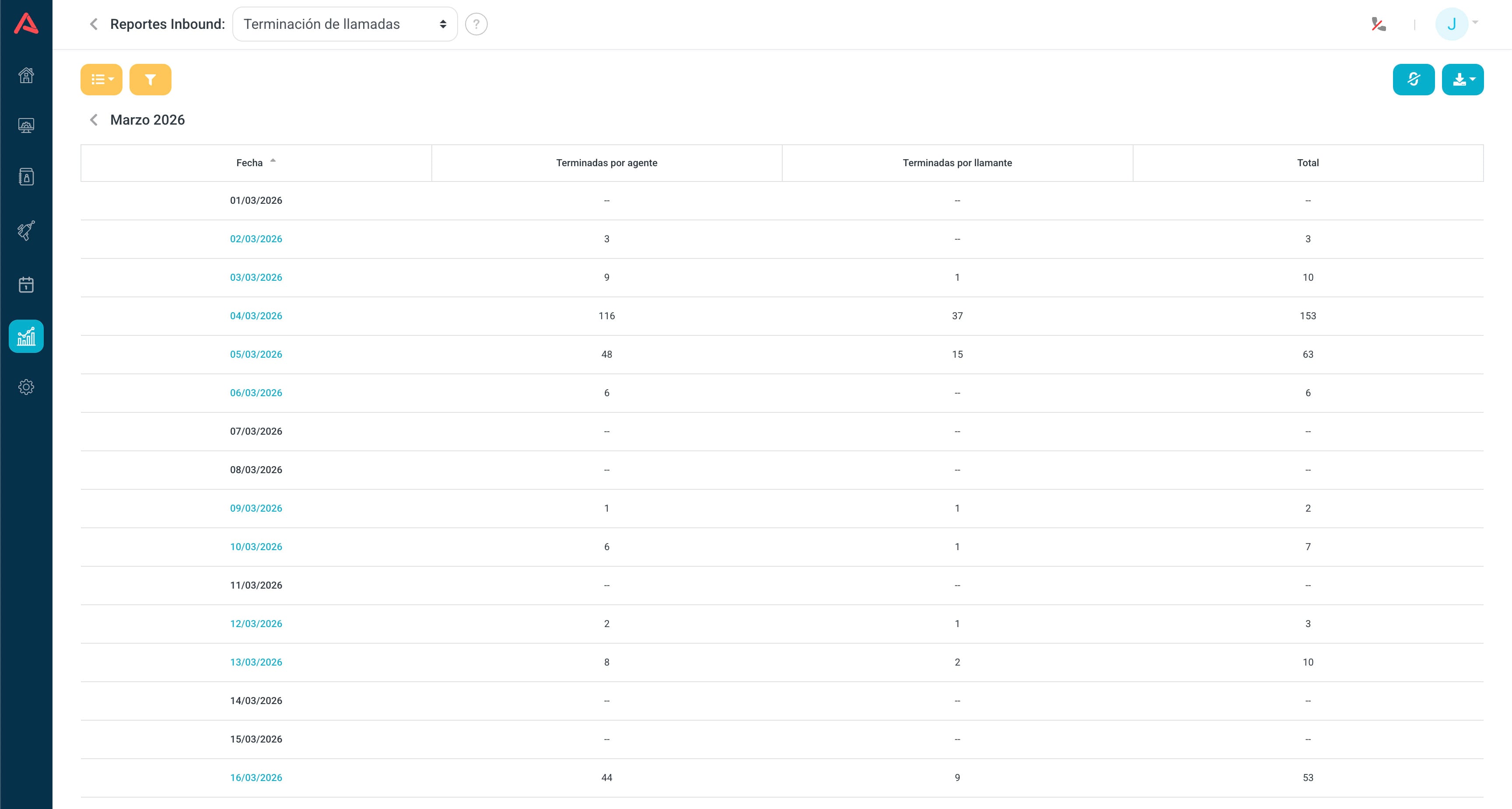
It carries three figures per period, in absolute counts: finished by agent, finished by caller and the total. It drills from month to day to hour, and inside the hour groups into 15, 30 or 60 minutes. It filters by Date, Groups and Campaigns.
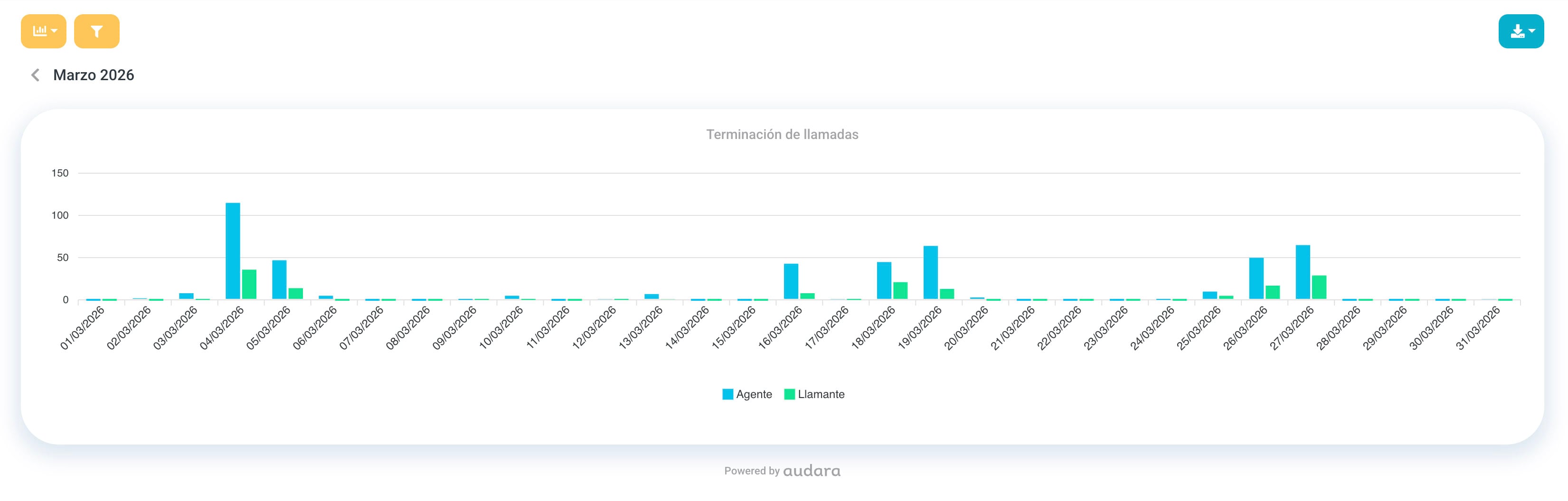
What you decide with it
In most operations the customer is the one who hangs up, because they are the one who decides their business is done. When that proportion flips over a sustained period, it is worth asking why agents are the ones closing calls.
The other way round says something too: a spike of customer-ended calls in one particular band, alongside a low AHT in that same band, is usually people hanging up in frustration rather than people who are satisfied.
The call-by-call detail is in Calls History, which carries the Finished by column. This report is the aggregate view of that column.
Activity by Route
It is exactly the Campaign Activity report, with the same metrics and the same formulas, but grouped by phone route instead of by campaign.
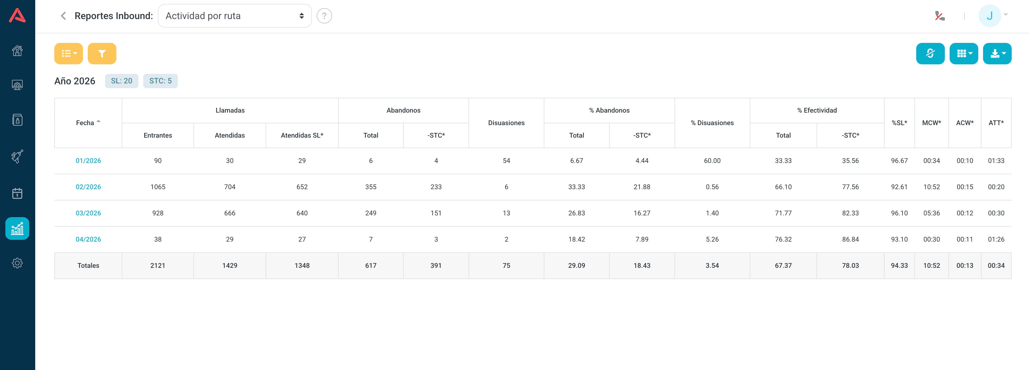
What changes is the question it answers. The campaign one tells you how a team did; this one tells you how a way in did: a particular trunk, a published number, a routing flow.
When to use this one instead
When the problem smells technical rather than operational. If a trunk is failing, the campaign report spreads it across every campaign using that trunk and it disappears; grouped by route it jumps straight out.
It is equally good for comparing your published numbers against each other, or for confirming whether a routing change did what it was supposed to.
Campaign Typification
It consolidates how agents classified the calls they handled. This is where the operation gets translated into business language: not how many calls there were, but what they were about.
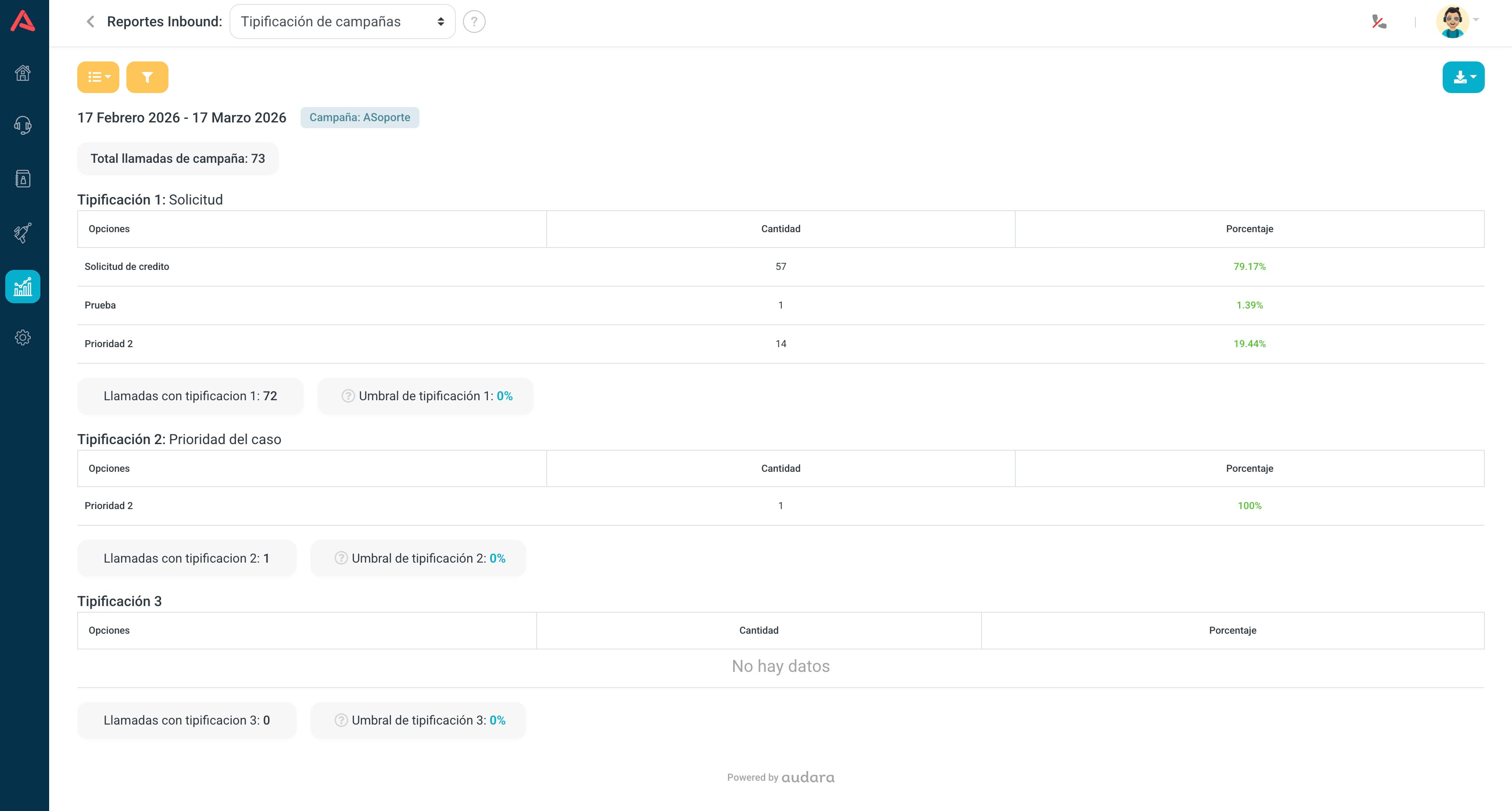
Audara handles up to three typification levels and the report shows them separately. At each one you see the Options configured for that campaign, the Amount of calls in each, and the Percentage it represents.
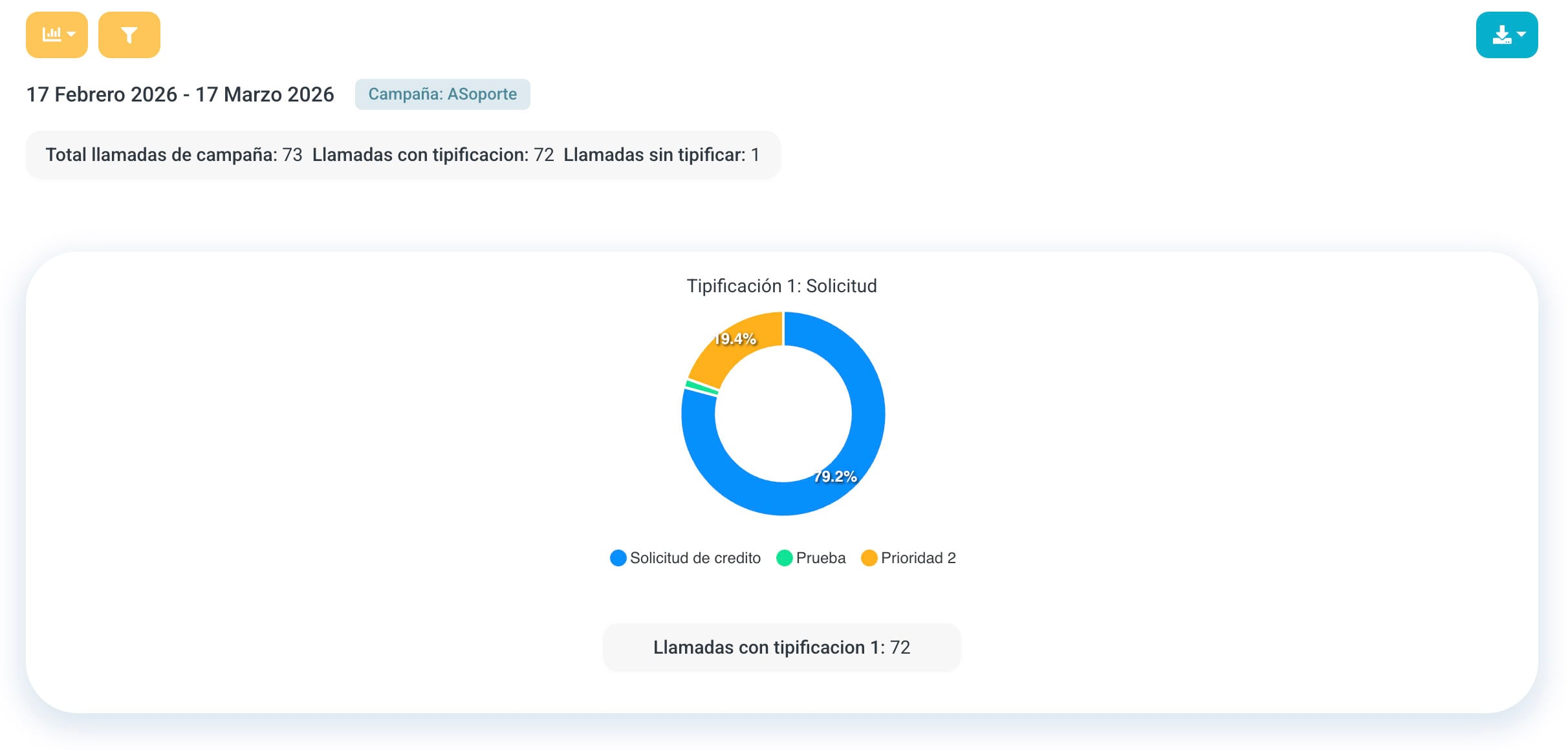
It also carries the calls with typification and a configurable threshold to see at a glance whether enough is being classified.
It filters by Date, Campaign and by each of the three Typification levels, which is what lets you isolate one kind of case.
Check how many calls are typified first. If it is 60%, the rest of the report describes a biased sample: the calls somebody bothered to classify, not all of them. No business conclusion holds up on that.
What you decide with it
This is the report that tells you what people are asking you for. A category taking half the volume is a candidate for a bot or an IVR option, and that frees agents for what genuinely needs a person.
It also exposes a badly built catalogue: if nobody ever picks an option, or if "Other" is the most frequent one, the problem is not the operation but how the categories are defined.
Campaign Effectiveness
The simplest report in the group, deliberately. One row per day with three figures: how many calls arrived, how many were answered, and what percentage that is.
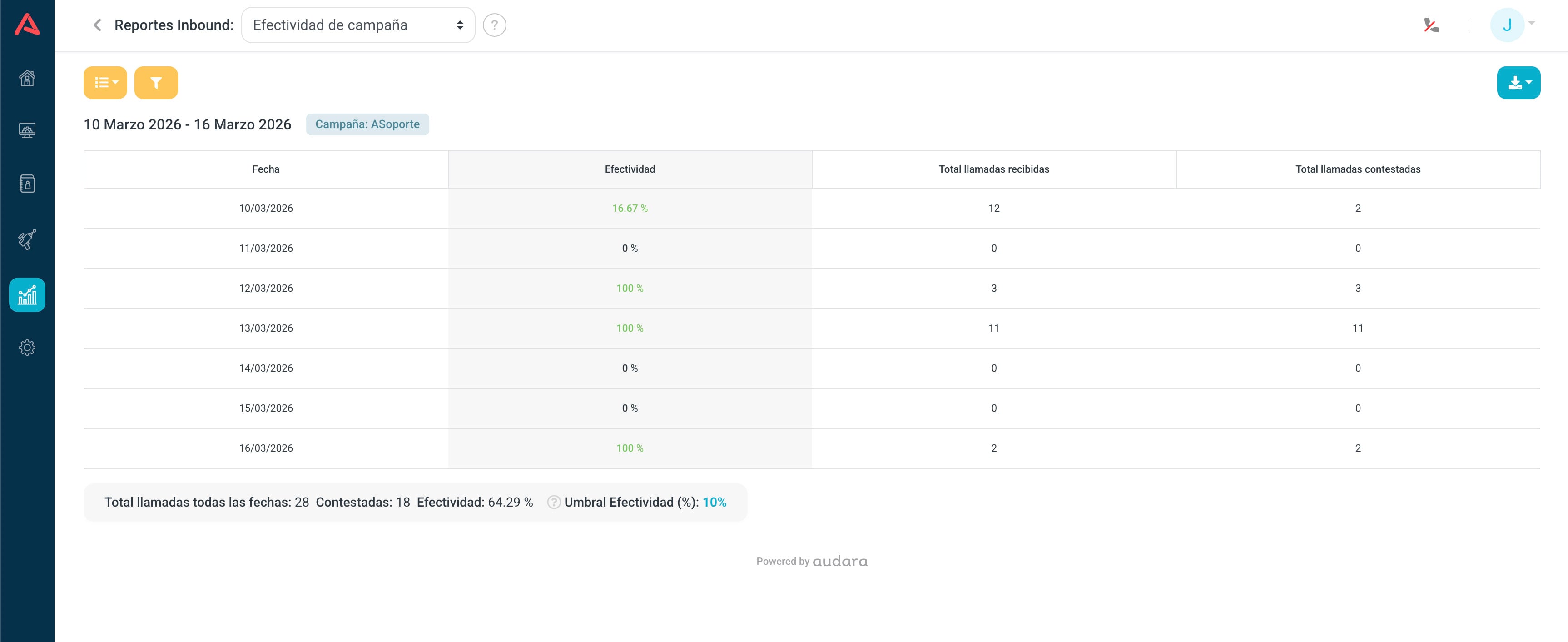
| Column | What it tells you |
|---|---|
| Date | The day |
| Total calls received | How many reached the campaign |
| Total calls answered | How many an agent handled |
| Effectiveness (%) | (answered / received) × 100 |
You set an effectiveness threshold and the percentage comes out green if it clears it and red if it does not, so a month audits in five seconds. It filters by Date and Campaign.
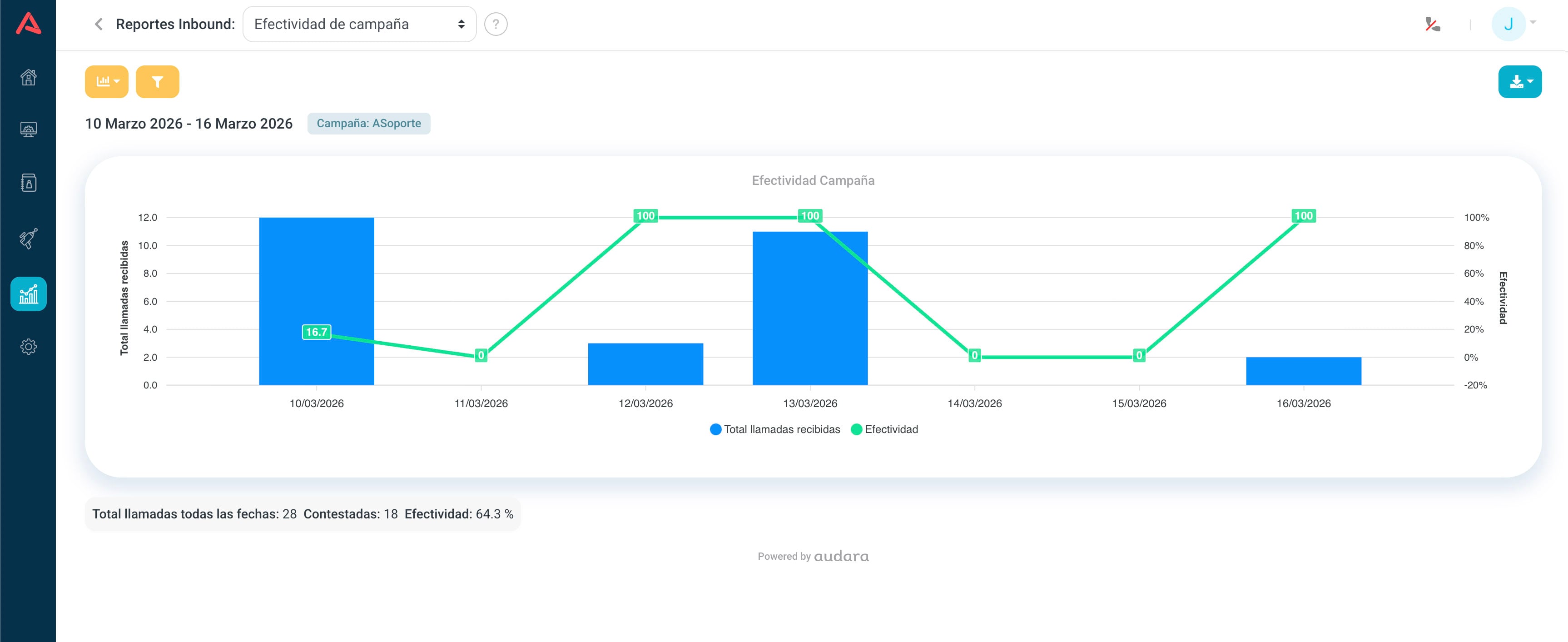
This is the one to look at daily and the first to open when somebody asks how things are going. The red days get chased afterwards in Campaign Activity, which is where the why lives.
Occupancy
It measures how much operational time a campaign is consuming. It is consolidated per campaign, not per agent.
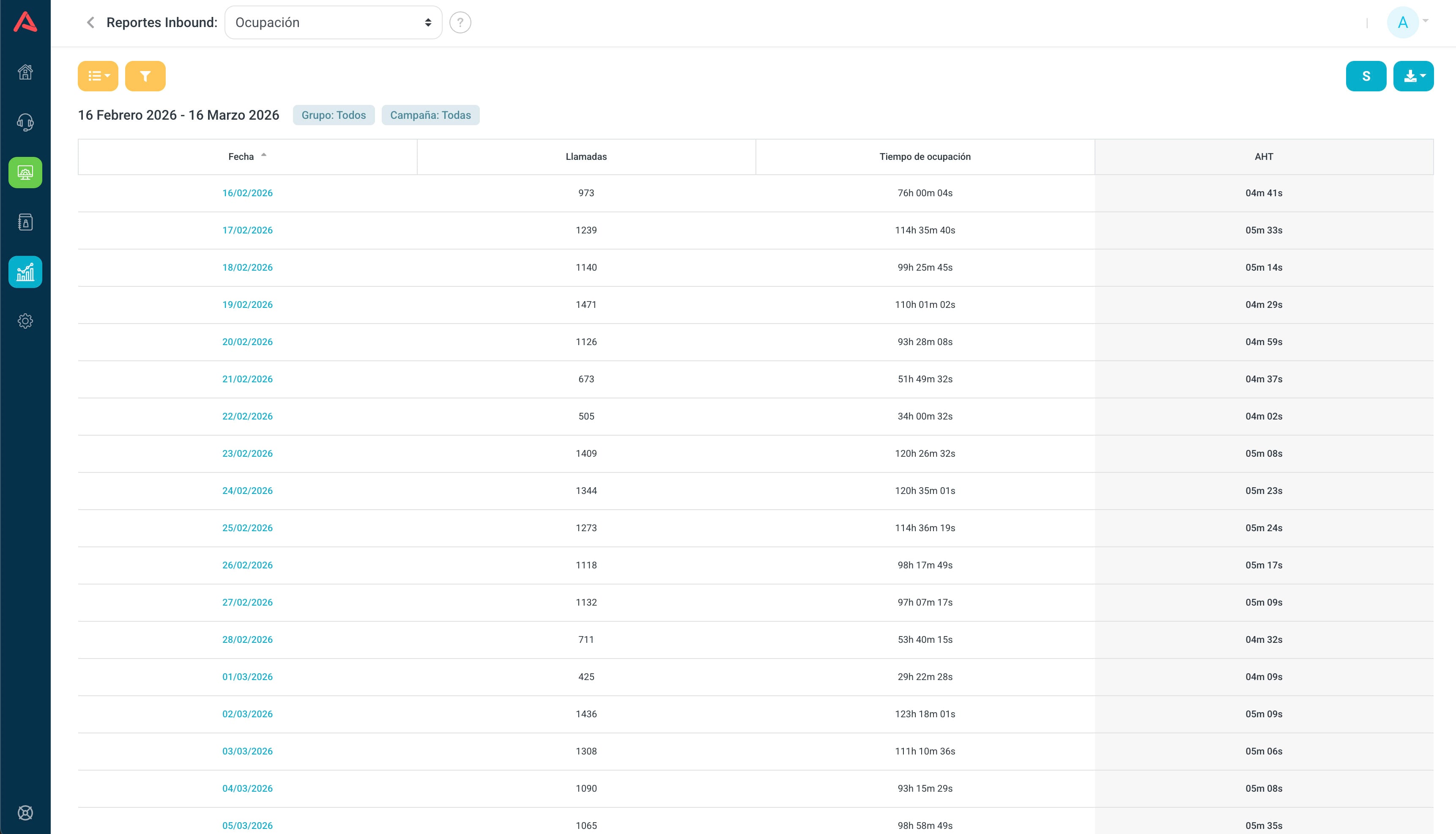
For each period it shows answered calls, the total occupancy time and the AHT, the average. You see it by date when looking at a range, and by hour when you go into a day.
Graph view
In the graph view you can easily pick out:
- Peaks of operational load
- Swings in AHT
- Patterns by hour or by day
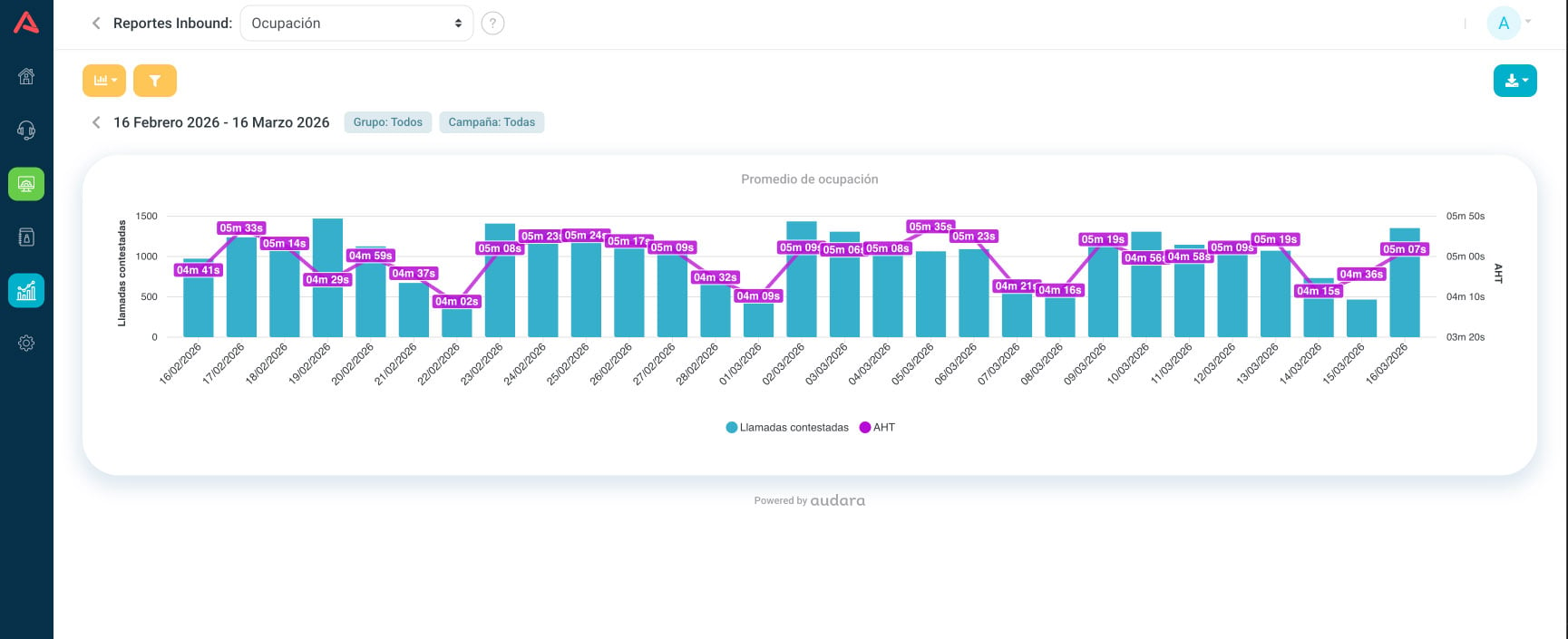
The value of this report is in reading both series together. AHT rising while volume rises is normal: there is pressure. AHT rising with flat volume is something else, usually a process that got complicated, a slow system, or new people. That second case is the one to chase.
Surveys
It gathers what customers said at the end of the call. There are three separate indicators and they are worth keeping apart.
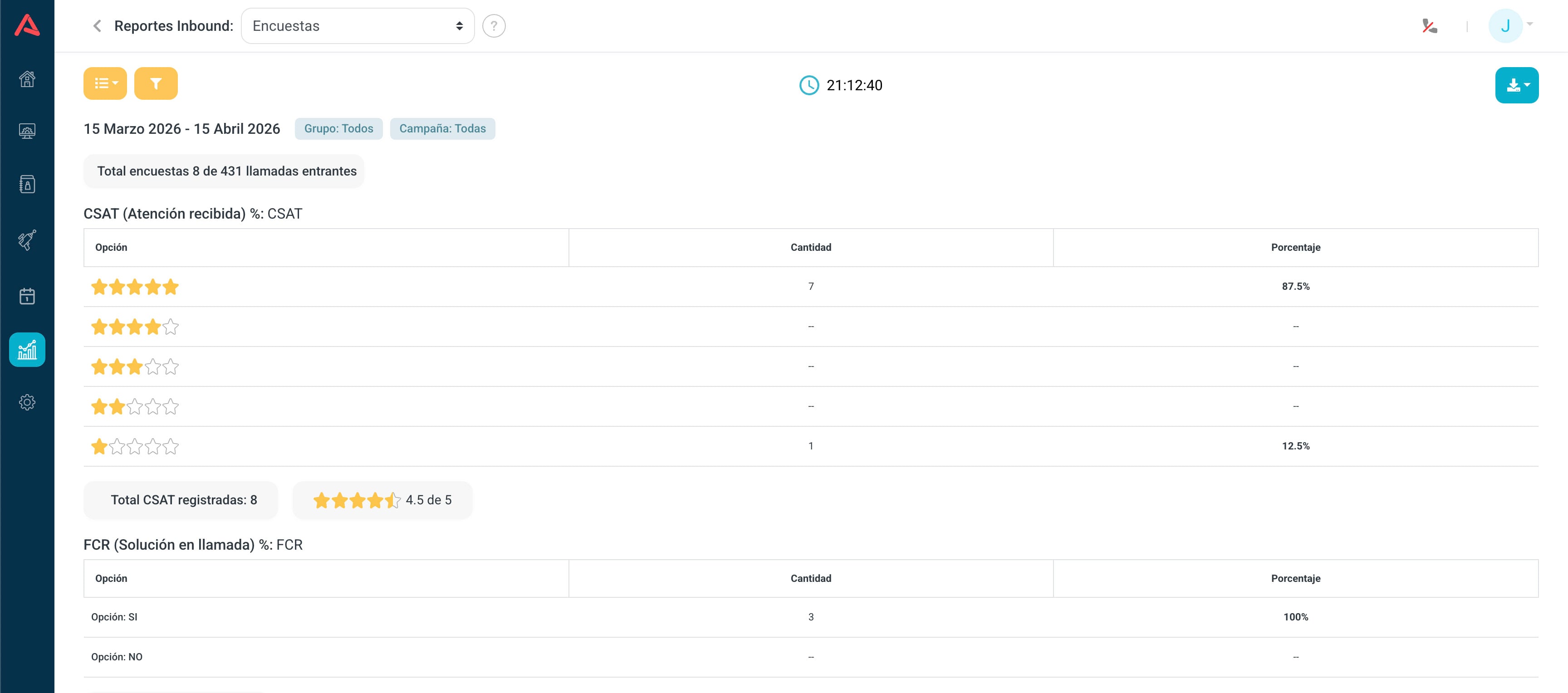
- CSAT
- How satisfied they were with this call. Answered in stars.
- FCR
- Whether they were sorted out on first contact. A yes or a no.
- NPS
- Whether they would recommend the service. A scale.
For each you get the number of responses per option, its percentage, the averages and, most importantly, the total surveys against total calls.
You can view it as a table, as a graph by score, and as a graph by campaign, which is the one for comparing operations against each other.
Total surveys against total calls is the number to read before any average. If 5% respond, that CSAT does not describe your customers but the ones who stayed on to answer, who tend to be the very happy and the very annoyed. An average over few responses moves on its own.
How to read the combinations
The three indicators say less on their own than crossed:
- High FCR and high CSAT
- The operation is healthy: you resolve things and the experience is good too.
- High FCR and low CSAT
- You resolved it, but the road there was bad. Usually a long wait or a curt manner.
- Low FCR and high CSAT
- People are handled well but cannot get things resolved. Almost always a lack of tools or permissions, not of attitude.
- Lots of high scores and lots of low ones at once
- Inconsistency. The average looks acceptable and hides that the experience depends on who picks up.