Quality control
Recordings, Speech Analytics and the analysis of what was said
What Quality control is
Quality control is one of the blocks in the Reports menu, and it answers a different question from all the others. The rest of the reports count how many interactions there were and how they did on times. This one covers what was said in them.
The dropdown in the header has four entries:
- Recordings
- The call audio, in three views: PBX, Inbound and Outbound. This is where you listen, transcribe and download.
- Speech Analytics
- The analysis of those calls. It is what turns a recording into a figure.
- Text Analytics
- The same thing, over written conversations.
- Omnichannel
- How many interactions you had per channel, day by day.
All four share the toolbar, the filters and the download explained in the Reports article, with one important difference worth knowing up front: Speech Analytics and Text Analytics do not open on today's data, they open empty.
Underneath they are seven permission modules, not four: the three Recordings views and the two Speech Analytics channels are granted separately. On screen they get grouped, so the dropdown shows you fewer entries than your role has ticked.
Recordings
This is the most straightforward report in the group: one row per recorded call, with a button to play it.
It has three views, and they are not three different reports but the same report over three call origins:
- PBX
- Calls on the phone system, the ones that never went through a campaign.
- Inbound
- The ones an agent took on an inbound campaign.
- Outbound
- The ones that went out from a dialer.
You switch between them with the yellow dropdown on the left, the one labelled with the name of the view. If you only have permission on one of them, that dropdown does not show up and the screen looks as though that is the only one there is.
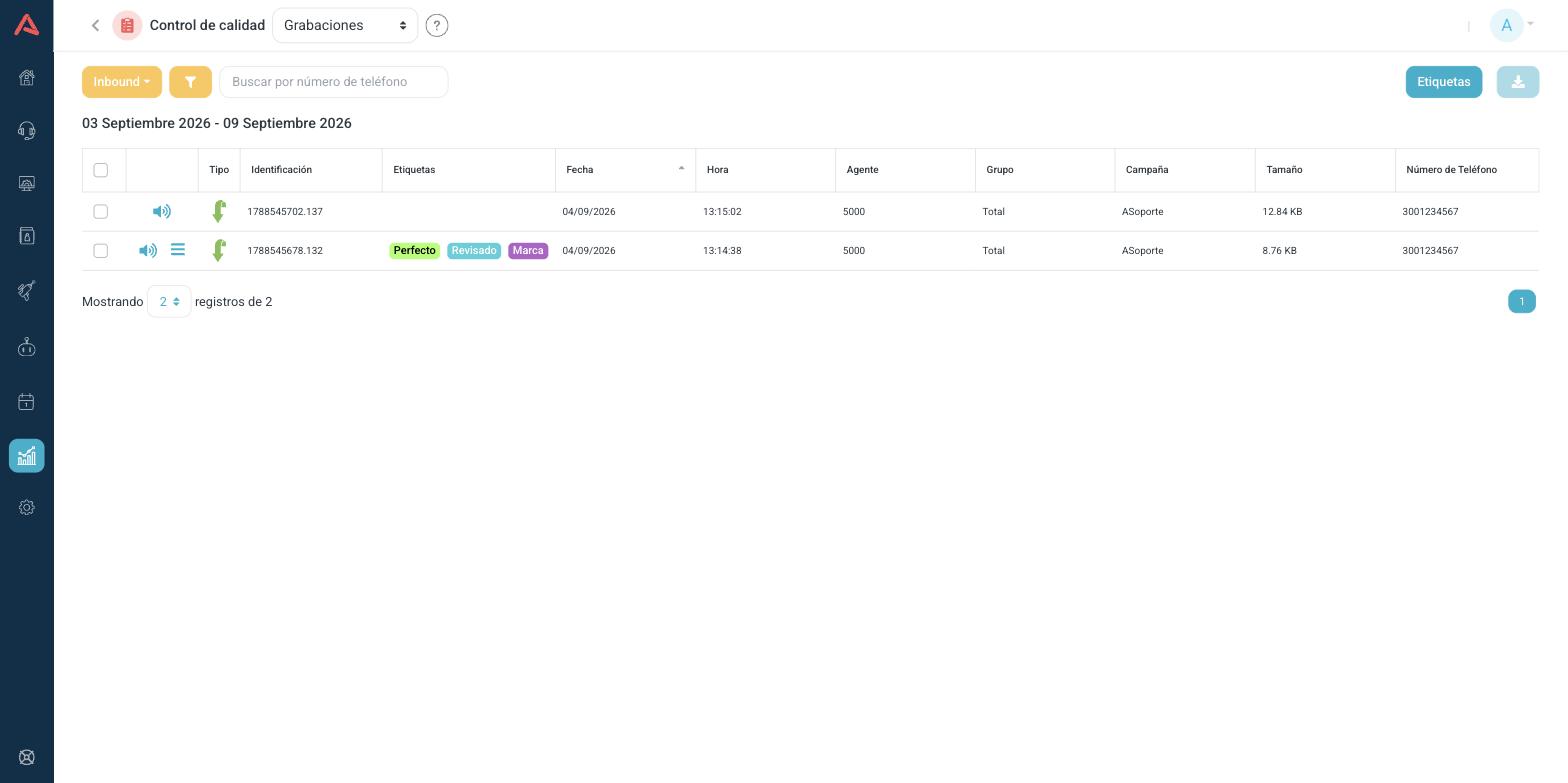
The columns change with the view
Each view shows what makes sense for its origin, so the table is not the same:
| Column | PBX | Inbound | Outbound |
|---|---|---|---|
| Type | Yes | Yes | Yes |
| Identification | Yes | Yes | Yes |
| Tags | No | Yes | Yes |
| Date and Hour | Yes | Yes | Yes |
| Origin and Destination | Yes | No | No |
| Agent | No | Yes | Yes |
| Group and Campaign | No | Yes | No |
| Dialer | No | No | Yes |
| Phone Number | No | Yes | Yes |
| Size | Yes | Yes | Yes |
Identification is the call's unique id. It is the same number you will see in the CDR and in Speech Analytics, and it is what lets you follow one call from report to report. Type shows as an icon: hover over it to see what it means.
Next to the play button, some rows carry a second icon of stacked lines and others do not. That is not a glitch: it only appears when that recording already has a comment or a transcript. It is the quick way to see, without opening anything, which ones somebody has already worked on.
Tags
On Inbound and Outbound you can mark recordings with your own tags, which you create from the Tags button on the toolbar. They are for building your own sample: the ones you already reviewed, the ones to listen to with the supervisor, the ones going to a committee. The filter panel then lets you ask for only those.
Downloading the audio
The blue download button here does not fetch a CSV: it fetches the audio. And it only works on the recordings you ticked in the list, so you select first and download after.
If one of the recordings you ticked is no longer on disk, Audara warns you before fetching the rest and asks whether you want to continue. When it finds none of them, it tells you and downloads nothing.
The recording player
Opening a recording brings up the player, and that is where almost everything interesting in this module happens. From Recordings it has three tabs:
- Info
- The id, the date and the hour, and that recording's tags.
- Comment
- A note you leave on the recording, which is saved.
- Transcript
- What was said, split into client and agent.
When you open the same player from Speech Analytics, two more tabs appear, Matches and Analysis, which come out of the analysis. They are covered further down.
The transcript
The transcript comes out in two columns, Client on the left and Agent on the right, with the time of each turn. Every phrase is a link: click it and the audio jumps to that moment. That is how you audit a long call without listening to all of it.
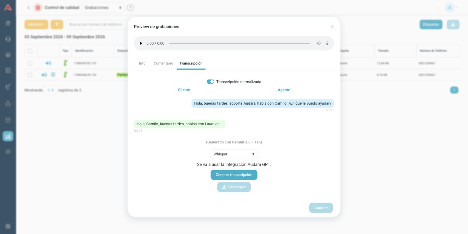
Below it there is a model picker. A model is whoever does the transcribing, and they do not all cost or understand the same. The list carries Audara's own tiers, which do not consume any of your integrations, and the models of whichever providers you have connected, each by name. Above the transcript you are looking at, it says which one produced it.
When you pick a model other than the one already on screen, Generate transcript becomes available.
Generating a transcript spends from your AI integration, which is why Audara tells you which one it will use before you do it. If you have a single integration from that provider, the line "The X integration will be used" appears; if you have several, it lets you pick; and if you have none that can run that model, it says so instead of letting you try. That line is worth reading, especially if one of your integrations is the production one.
On outbound calls Audara's own tiers do not appear. There the transcript is always run by one of your providers.
Normalized transcript
When the model misspells a term from your business, a product name or an acronym, Audara corrects it against your campaign's term list and keeps both versions. The Normalized transcript switch lets you see the corrected one or the literal one, and Show changes shows you what was changed.
Those two switches only appear when there is something to show. If the model got everything right in the first place, the normalized version comes out identical to the literal one and the switch would have nothing to toggle. Its absence does not mean normalization did not run.
Speech Analytics
Speech Analytics is the report that turns recordings into figures. It takes the transcribed calls, runs them through the analysis categories you configured, and tells you, across all of them at once, how well they were handled.
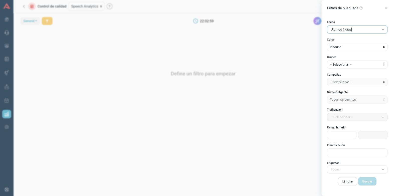
This report does not open on today's data. It opens empty, with the message "Select Filter to Start", and searches nothing until you pick a date and a channel. That is deliberate: analysing costs more than counting, and an automatic search on entry would pull a volume that is almost never the one you wanted.
The filters build up in steps
The panel starts with two fields, Date and Channel. The channel is where you choose between Inbound and Outbound, and until you choose it the rest does not appear: the groups, the campaigns, the agent, the typification, the time range, the id and the tags.
The four views
The first dropdown on the toolbar changes the view, and each one answers a different question about the same period:
- General
- One row per call. This is the audit view: from here you open one specific conversation.
- Campaigns
- One row per campaign, with how many interactions were analyzed and the overall average.
- Agents
- The same by agent. This is the view for a team meeting.
- Categories
- What share of the calls met each category.
The three summary views can be shown as a list or as a chart, with the button next to it.
Changing the view clears the search: you go back to "Select Filter to Start" and have to filter again. And the filter panel is not the same in all of them: in Categories, for instance, it only asks for date, channel, group and campaign.
The General view
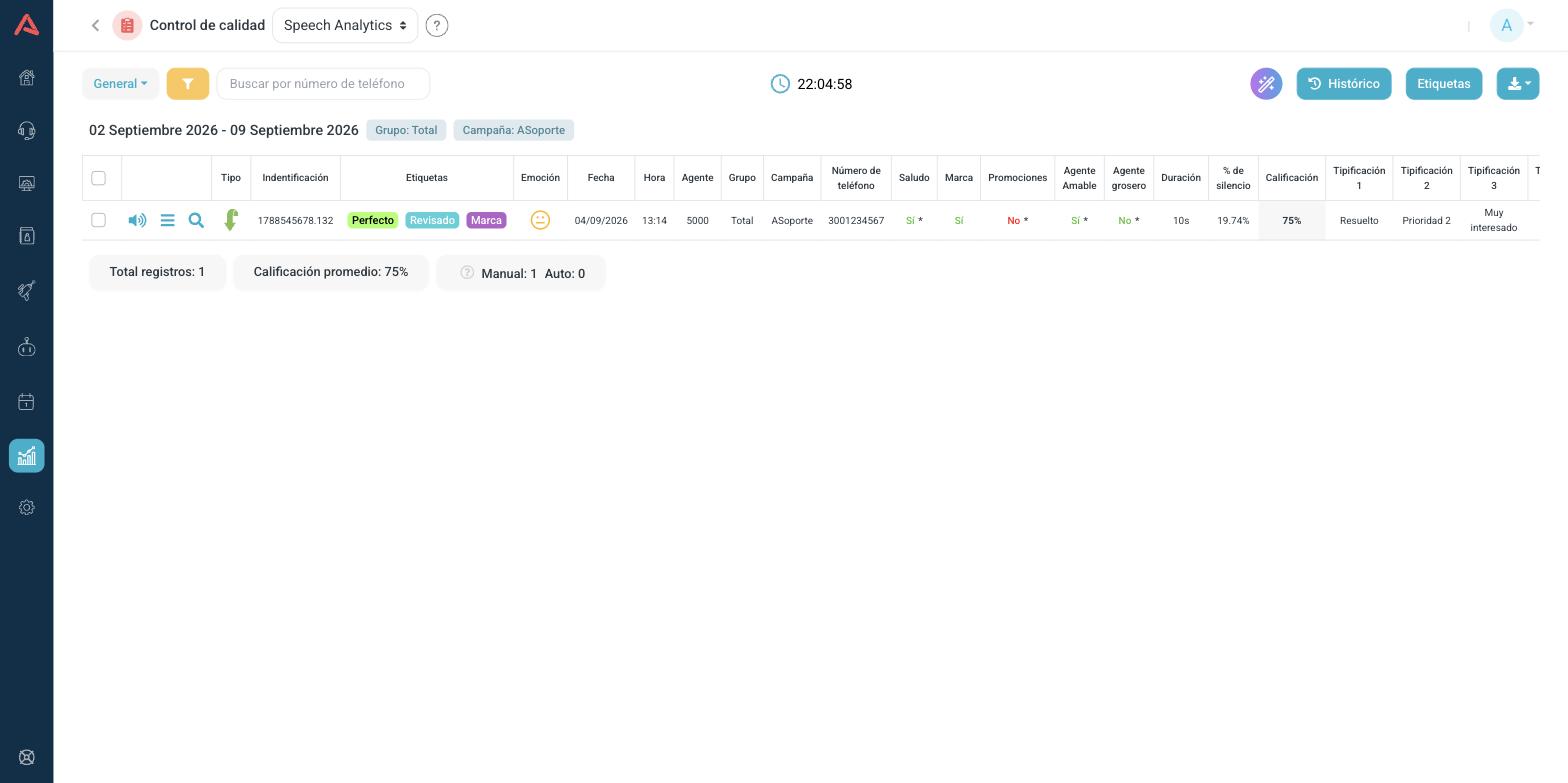
It is the widest table in the product, and its most important part is the one no other table has: between the phone number and the duration there is one column per analysis category, with Yes or No on each call.
Those columns are read by colour, not by the word. Green means it came out as expected, and red the opposite. That is why a "No" under Rude agent shows in green: there, no is what you want.
The ones carrying an asterisk are the ones that count towards the score. A category without an asterisk is still measured and reported, but it does not move the score.
Of the remaining columns, the ones worth knowing are:
- Emotion
- How the conversation ended in terms of tone: positive, neutral or negative. It shows as a face.
- % of Silence
- How much of the call nobody spoke.
- Score
- The mark that call got.
- Typification 1 to 4
- What the agent marked on closing. The fourth is the open typification.
- CSAT, FCR and NPS
- What the customer answered in the survey, when there was one.
Under the table sit the totals for the period: how many records, the average score, and how many analyses were run by hand and how many automatically.
% of Silence is the number in this table that pays off most and gets used least. High silence on a short call is usually an agent hunting for something they should have at hand, and that is fixed with a tool, not with training.
Why that call got that score
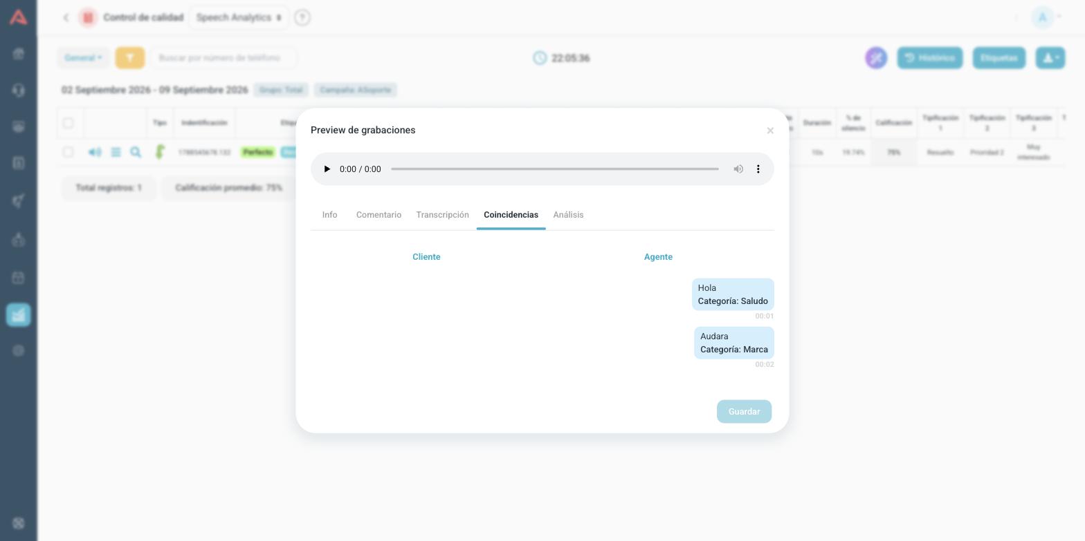
From the General view, each call's player carries two extra tabs. Matches shows the exact phrase that made each category come out Yes, with the time it was said.
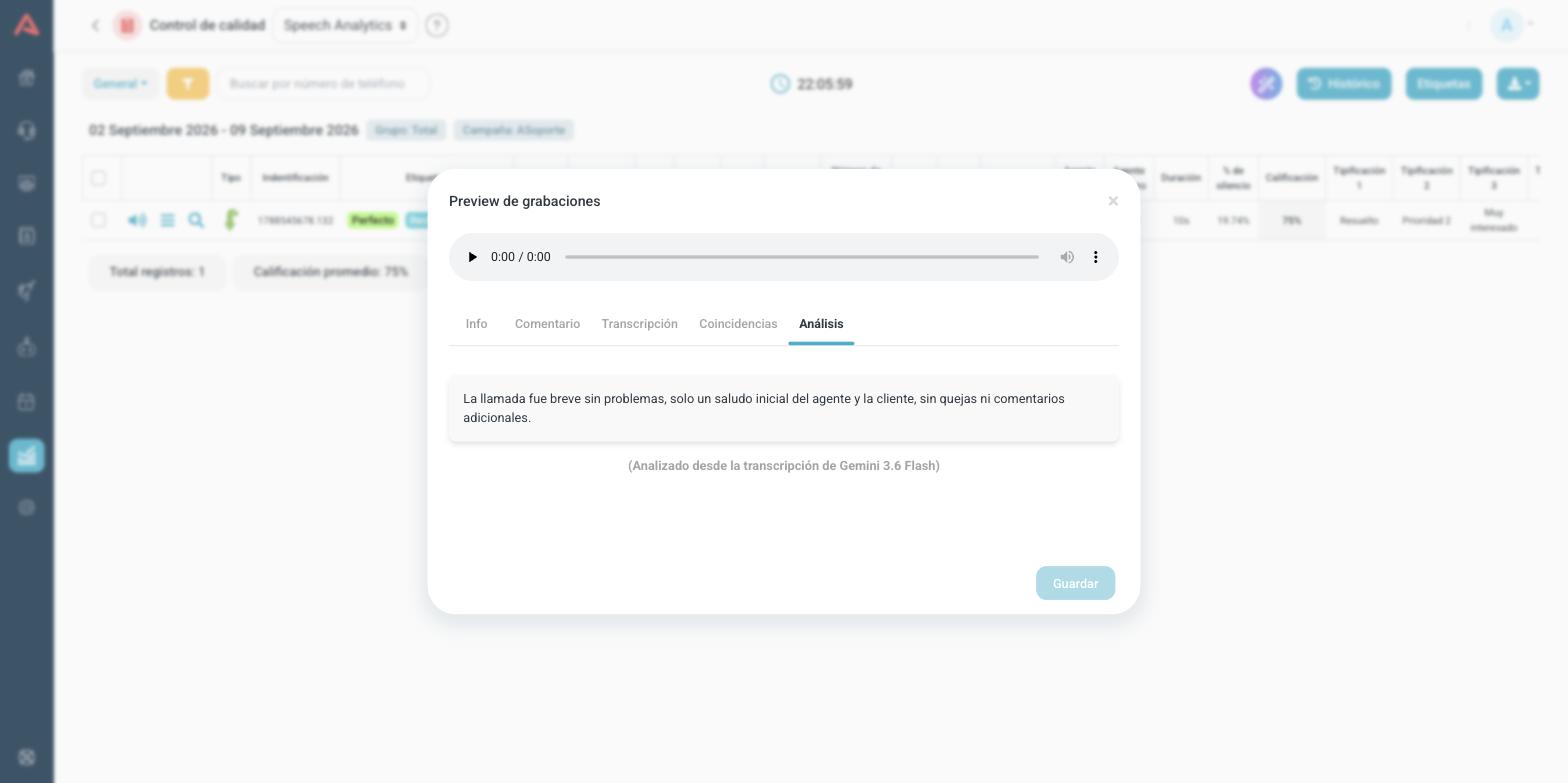
Analysis is the summary the AI wrote about the conversation, and underneath it says which transcript it was analyzed from.
The Categories view
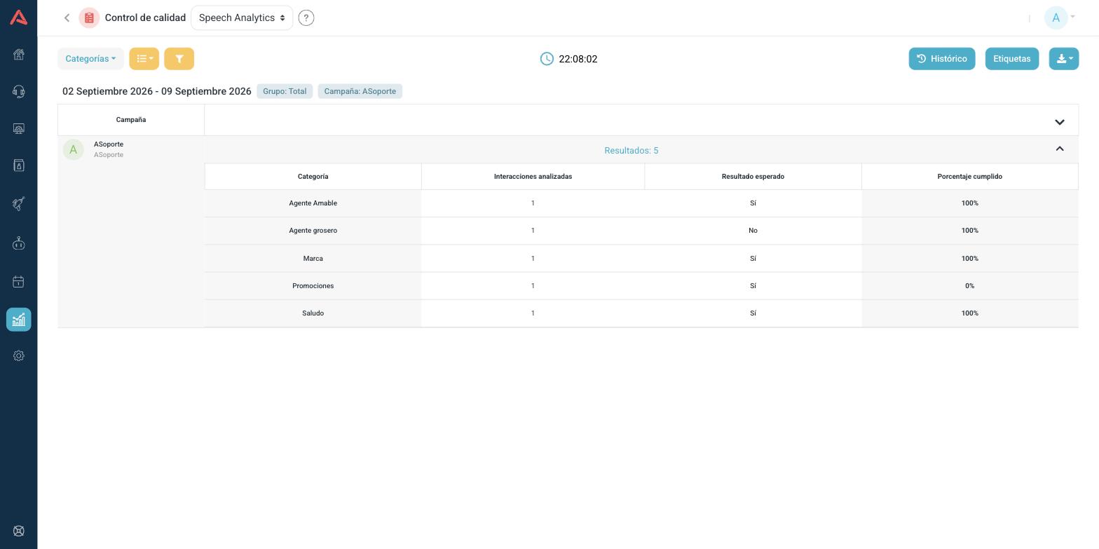
This view unfolds by campaign, and inside each one it lists its categories with three figures: how many interactions were analyzed, what the Expected Result is, and what Fulfillment Percentage was reached.
It is the view to look at when the average score drops, because it says exactly where things are falling. A 0% on a single category explains more than the overall mark.
Downloading
The blue download button is a dropdown with two options: Recordings, which fetches the audio, and Download CSV, which fetches the table.
In the General view both options require you to have ticked rows. That is different from the rest of the reports, where the blue button fetches whatever is on screen. In Campaigns, Agents and Categories the CSV does fetch everything.
AI Analysis and History
The AI Analysis button, the round one on the right, asks the AI to read the whole result and explain it to you. You can ask for it over the data, over the conversations or over the summaries.
The History button does the opposite: it sends days that have already passed off to be analyzed.
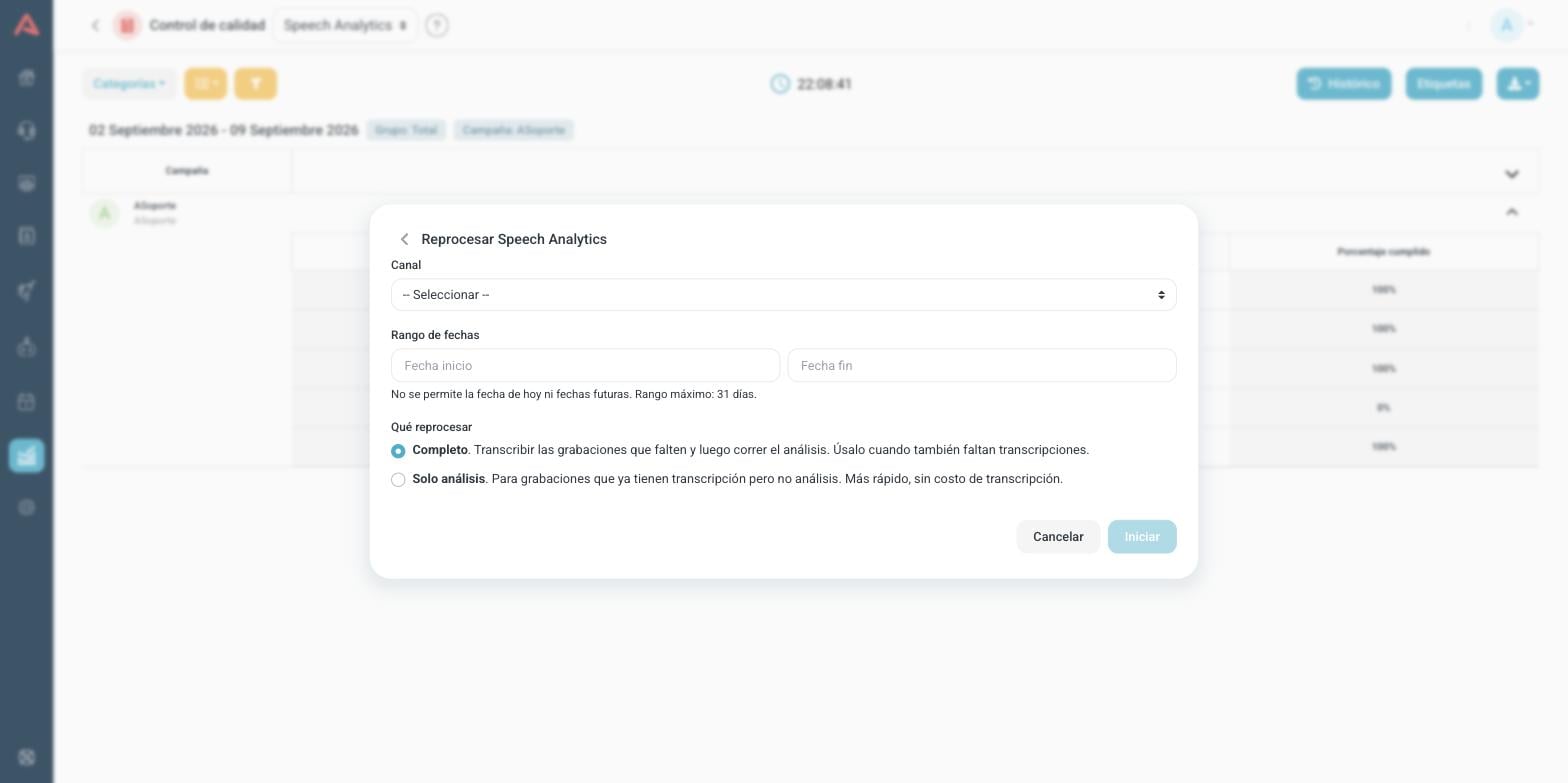
You pick the channel, the campaigns or dialers, the date range and what to reprocess. Analysis only is faster and does not pay for transcription again, and it is what you want when the recordings are already transcribed but have no analysis. Full transcribes whatever is missing first.
A long range can take hours. You can close the window and come back later: the same screen lists previous backfills with their status, how many recordings were analyzed, how many were skipped and why.
History has three limits worth knowing beforehand: today and future dates are not allowed, the maximum range is 31 days, and only users who have that permission see it at all. On top of that, each person can only reprocess the campaigns and dialers their user reaches.
Text Analytics
Text Analytics is Speech Analytics for what was written. It analyzes chat conversations instead of calls, and it works the same way: the same categories with their Yes or No and their asterisk, the same emotion, the same score and the same typifications.
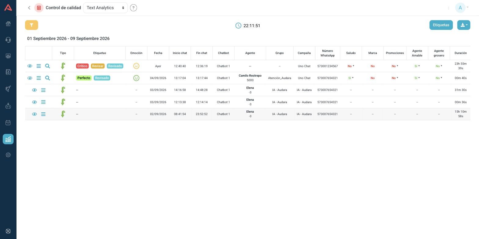
What changes are the columns that only make sense on a chat: instead of origin and destination it carries the Chatbot that handled things before the agent, the chat start and end times, and the contact's WhatsApp number.
This report also opens empty and waits for you to define a filter.
There is no audio here, so the first icon on each row is not play but open the conversation. The transcript is the chat itself, there is nothing to generate.
Omnichannel
This one analyzes nothing. It is a summary that answers a single question, and answers it well: where your people are coming in from.
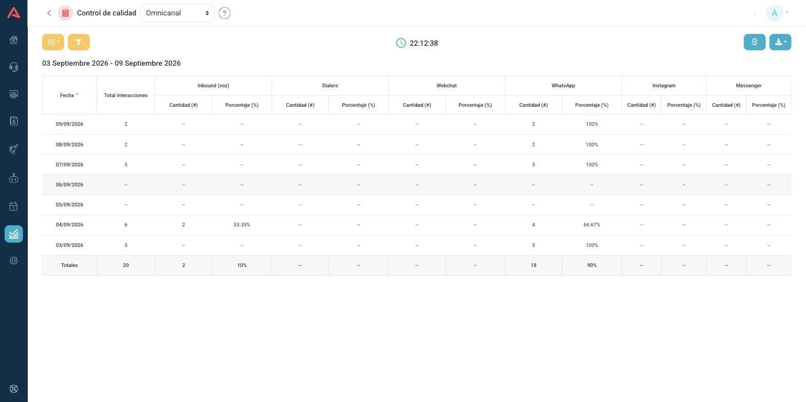
One row per day, and in each one the total interactions split across six channels: Inbound (voice), Dialers, Webchat, WhatsApp, Instagram and Messenger. Each channel carries two columns, the quantity and the percentage, and at the end there is a totals row.
Unlike the two analytics reports, this one does open on its own, on the last seven days. It can be shown as a table or as a chart, there is a button to show zeros instead of dashes, and the CSV carries the twelve fields separately.
This report is read by watching the percentage across several weeks, not the count on one day. A channel growing five points a month is a staffing decision you want to make with time to spare, and it is exactly the kind of change you cannot see in the totals.
Who sees what
The group's seven modules are granted separately in the user's role, inside the Users module, and that is what decides which entries show up in the header dropdown.
On top of that, the user's limits narrow what they see inside each report: if their role is limited to certain inbound campaign groups or certain dialers, they will only see the recordings and the analysis for those. The History permission is separate from all of the above.